Skip to content
Wednesday, July 1, 2026
  • Learn By Example: Python File Organizer – Learn Windows Automation using os, shutil, and pathlib
  • Data Analysis with R: Tutorial for Beginners – Want to Learn Data Analysis with R, Start Here
  • Power BI: Say Goodbye to Complex DAX – Visual Calculations Made Easy
  • The Ten-Digit Empire: How Human Anatomy Built the Modern World (Base 10 System)

Virtual School

This Week
Log in
  • Home
  • Topics
  • Video Tutorials
  • Resources
  • Home
  • Topics
  • Video Tutorials
  • Resources
  • Learn By Example: Python File Organizer – Learn Windows Automation using os, shutil, and pathlib
  • Data Analysis with R: Tutorial for Beginners – Want to Learn Data Analysis with R, Start Here
  • Power BI: Say Goodbye to Complex DAX – Visual Calculations Made Easy
  • The Ten-Digit Empire: How Human Anatomy Built the Modern World (Base 10 System)

Virtual School

This Week
  • Home
  • Topics
  • Video Tutorials
  • Resources
  • Learn By Example: Python File Organizer – Learn Windows Automation using os, shutil, and pathlib

    2 weeks ago2 weeks ago
  • Data Analysis with R: Tutorial for Beginners – Want to Learn Data Analysis with R, Start Here

    2 weeks ago2 weeks ago
  • Power BI: Say Goodbye to Complex DAX – Visual Calculations Made Easy

    1 month ago1 month ago
  • The Ten-Digit Empire: How Human Anatomy Built the Modern World (Base 10 System)

    2 months ago2 months ago
  • PowerPoint: Creating Automated Dynamic Presentations with SQL Server Data Integration using Excel

    2 months ago2 months ago
  • PowerShell Lesson 001 Mastering the Environment and Creating your first Script

    2 months ago2 months ago
  • SQL: Unlock SQL Server’s Brain! The Master Database Tutorial including Critical Admin Commands

    3 months ago3 months ago
  • Power BI: Fleet Performance Logistics Dashboard with Driver Safety, Efficiency, and Compliace KPIs

    4 months ago4 months ago
  • How to define functions in Python: A complete guide for Beginners

    4 months ago4 months ago
  • Python Control Flow Mastery: Interruptions and Iteration for Beginners

    4 months ago4 months ago
  • Home
  • Data visualization
  • Page 3

Data visualization

  • Power BI

Power BI Q&A: Best Practices for Effective Data Exploration

Admin1 year ago1 year ago02 mins

Welcome to our tutorial on the Power BI Q&A visual, where we’ll guide you through effectively utilizing this feature and…

Read More
  • Power BI

Power BI: Snowflake vs. Star schema explained in detail, with simple example and a dashboard

vs_wp_admin1 year ago1 year ago01 mins

This Power BI tutorial guides you through data modeling, focusing on the star and snowflake schemas. You’ll learn how to…

Read More
  • Power BI

What is Power BI? Complete Introduction and Walkthrough for Beginners.

Admin1 year ago1 year ago02 mins

This video introduces and walks through the Power BI solution, a business analytics service by Microsoft that provides interactive visualizations…

Read More
  • Power BI

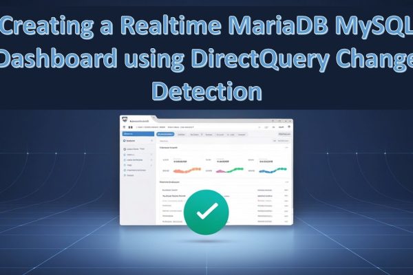
Power BI: Creating a Realtime MariaDB MySQL Dashboard using DirectQuery Change Detection

Admin1 year ago1 year ago01 mins

This video tutorial demonstrates how to connect to a MariaDB or MySQL server in Power BI using Direct Query with…

Read More
  • Looker Studio

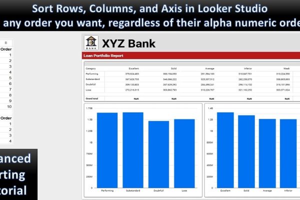
Looker Studio: Sorting Rows, Columns and Axis in any Order You Want

Admin1 year ago1 year ago02 mins

This tutorial explains how to sort data in Looker Studio in a custom order, beyond the standard alphabetical or numerical…

Read More
  • Power Automate
  • Power BI

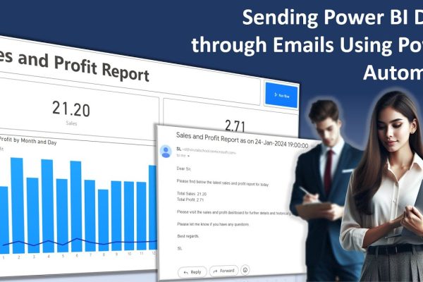
Sending Power BI Data through Emails Using Power Automate

Admin1 year ago1 year ago01 mins

This tutorial demonstrates how to create a Power BI dashboard to monitor sales and profit data, and then automate the…

Read More
  • Google Looker Studio

Introduction to the Looker Studio

Admin2 years ago2 years ago02 mins

Looker Studio (formerly Google Data Studio) is a powerful and user-friendly data visualization and reporting tool that helps you transform…

Read More
  • MS Excel

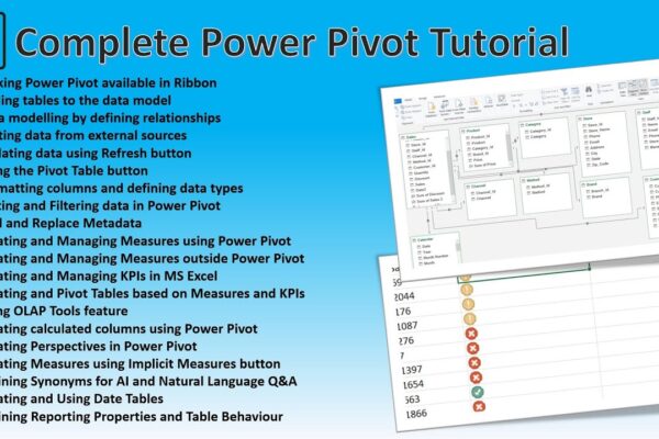
Power Pivot Advanced Concepts – A Complete Guide to Power Pivot

Admin2 years ago2 years ago01 mins

This tutorial provides a comprehensive overview of Power Pivot in Excel, covering topics such as data modeling, creating relationships, working…

Read More
  • Power BI
  • SQL

Creating Business Intelligence Dashboards from SQL Server Tables and Views

Admin2 years ago2 years ago01 mins

This tutorial demonstrates how to create a comprehensive Power BI report using data from a SQL Server database. We’ll delve…

Read More
  • Power BI

Time Intelligence in Power BI: A Visual Guide

Admin2 years ago2 years ago01 mins

This video tutorial introduces time intelligence calculations and their visualization using Power BI dashboards. It covers various time intelligence concepts,…

Read More
  • 1
  • 2
  • 3
  • 4
  • 5
  • …
  • 12
Log in
  • Apps (1)
  • Resources (1)
    • Datasets (1)
  • Topics (12)
    • Data Analysis Expression (DAX) (3)
      • Complete List of DAX Functions (2)
    • Google Looker Studio (3)
      • Complete Guide to the Looker Studio (1)
    • MS Excel (1)
      • Mastering MS Excel (1)
    • Power BI (1)
    • Python (4)
      • Python Complete Course (4)
  • Uncategorized (1)
  • Video Tutorials (311)
    • C# (1)
    • DAX (10)
    • Google Charts (2)
    • HTML (8)
    • JavaScript (8)
    • Looker Studio (12)
    • Maths (1)
    • MS Access (1)
    • MS Excel (61)
    • MS Power Point (3)
    • Other (1)
    • Power Apps (1)
    • Power Automate (4)
    • Power BI (147)
    • Power Query (M Language) (4)
    • Python (55)
    • Quiz (1)
    • R (3)
    • SQL (32)
    • Tableau (1)
    • Unity3d (1)
    • Windows PowerShell (1)

Recent Posts

  • Learn By Example: Python File Organizer – Learn Windows Automation using os, shutil, and pathlib
  • Data Analysis with R: Tutorial for Beginners – Want to Learn Data Analysis with R, Start Here
  • Power BI: Say Goodbye to Complex DAX – Visual Calculations Made Easy
  • The Ten-Digit Empire: How Human Anatomy Built the Modern World (Base 10 System)
  • PowerPoint: Creating Automated Dynamic Presentations with SQL Server Data Integration using Excel

Recent Comments

  1. Admin on Power BI: Monitor Risk using Capital Adequacy and Risk Weighted Assets Dashboard
  2. Augustine Ahiatsi on Power BI: Monitor Risk using Capital Adequacy and Risk Weighted Assets Dashboard

Popular

1

Learn By Example: Python File Organizer – Learn Windows Automation using os, shutil, and pathlib

  • Python
2

Data Analysis with R: Tutorial for Beginners – Want to Learn Data Analysis with R, Start Here

  • R
3

Power BI: Say Goodbye to Complex DAX – Visual Calculations Made Easy

  • Power BI
4

The Ten-Digit Empire: How Human Anatomy Built the Modern World (Base 10 System)

  • Maths
5

PowerPoint: Creating Automated Dynamic Presentations with SQL Server Data Integration using Excel

  • MS Excel
  • MS Power Point
6

PowerShell Lesson 001 Mastering the Environment and Creating your first Script

  • Windows PowerShell
7

SQL: Unlock SQL Server’s Brain! The Master Database Tutorial including Critical Admin Commands

  • SQL
8

Power BI: Fleet Performance Logistics Dashboard with Driver Safety, Efficiency, and Compliace KPIs

  • Power BI

Copyright 2025 virtual-school.org