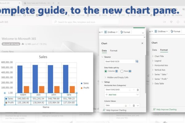
Complete Guide to the New Chart Pane in Excel Online

This video tutorial will guide you through using the new chart pane in Microsoft Excel Online to format and style your charts. What you’ll learn:Accessing the chart paneFormatting chart elements (title, legend, axis, gridlines)Data label optionsAdding error barsUsing trendlinesData table settings Video Outline:We’ll use sample data to create a chart.Pivot tables won’t work with the…

Read More

Performing Comparative Analysis by Pivoting Columns in Power Query

In this power BI visualization tutorial, we focus on comparing sales data from a vertical dataset across different years. Beginning with data transformation in the Power Query Editor, we progress to creating a comparative visual for a dashboard. Step by step, we navigate through loading data, adding visual elements like text boxes and line charts,…

Read More

Forecasting with Seasonal Autoregressive Integrated Moving Average (SARIMA) in Python/Excel

In this Python forecasting tutorial, we delve into predicting future global temperature changes using the SARIMA model, utilizing both Python and MS Excel. We start by acquiring data from NASA’s global climate change website and loading it into Python using the Pandas library. After cleaning and formatting the data, we construct our SARIMA model, setting…

Read More

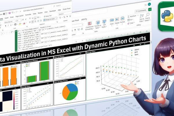
Data Visualization in MS Excel with Dynamic Python Charts

Welcome back, everyone! In this unique tutorial, we’ll guide you through creating a dynamic dashboard in Microsoft Excel using Python. Specifically tailored for those keen on mastering Python visualizations, we’ll delve into the world of Excel charts powered by Python’s Matplotlib library. Notably, unlike Excel’s native charts, Python charts seamlessly integrate within cells, providing a…

Read More

Assets Management in Power BI for Business and Finance Professionals

In this instructional session, finance professionals are guided through the process of managing assets and presenting financial data in charts. The focus is on calculating depreciation, accumulated depreciation, and net book value using two methods: straight line and declining balance. The tutorial demonstrates how to incorporate these calculations into a Power BI dashboard, emphasizing their…

Read More

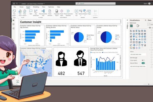
How to Create a Nice Customer Insight Dashboar in Power BI Desktop

In this tutorial, the presenter welcomes the audience back and introduces the creation of a customer insight dashboard using data available on Kaggle. The process involves creating age and rating buckets using Data Analysis Expression, exporting icons from PowerPoint, and incorporating them into the dashboard. The tutorial covers turning on map visuals, adjusting canvas size,…

Read More