Skip to content
Wednesday, July 1, 2026
  • Learn By Example: Python File Organizer – Learn Windows Automation using os, shutil, and pathlib
  • Data Analysis with R: Tutorial for Beginners – Want to Learn Data Analysis with R, Start Here
  • Power BI: Say Goodbye to Complex DAX – Visual Calculations Made Easy
  • The Ten-Digit Empire: How Human Anatomy Built the Modern World (Base 10 System)

Virtual School

This Week
Log in
  • Home
  • Topics
  • Video Tutorials
  • Resources
  • Home
  • Topics
  • Video Tutorials
  • Resources
  • Learn By Example: Python File Organizer – Learn Windows Automation using os, shutil, and pathlib
  • Data Analysis with R: Tutorial for Beginners – Want to Learn Data Analysis with R, Start Here
  • Power BI: Say Goodbye to Complex DAX – Visual Calculations Made Easy
  • The Ten-Digit Empire: How Human Anatomy Built the Modern World (Base 10 System)

Virtual School

This Week
  • Home
  • Topics
  • Video Tutorials
  • Resources
  • Learn By Example: Python File Organizer – Learn Windows Automation using os, shutil, and pathlib

    2 weeks ago2 weeks ago
  • Data Analysis with R: Tutorial for Beginners – Want to Learn Data Analysis with R, Start Here

    2 weeks ago2 weeks ago
  • Power BI: Say Goodbye to Complex DAX – Visual Calculations Made Easy

    1 month ago1 month ago
  • The Ten-Digit Empire: How Human Anatomy Built the Modern World (Base 10 System)

    2 months ago2 months ago
  • PowerPoint: Creating Automated Dynamic Presentations with SQL Server Data Integration using Excel

    2 months ago2 months ago
  • PowerShell Lesson 001 Mastering the Environment and Creating your first Script

    2 months ago2 months ago
  • SQL: Unlock SQL Server’s Brain! The Master Database Tutorial including Critical Admin Commands

    3 months ago3 months ago
  • Power BI: Fleet Performance Logistics Dashboard with Driver Safety, Efficiency, and Compliace KPIs

    4 months ago4 months ago
  • How to define functions in Python: A complete guide for Beginners

    4 months ago4 months ago
  • Python Control Flow Mastery: Interruptions and Iteration for Beginners

    4 months ago4 months ago
  • Home
  • Data visualization
  • Page 2

Data visualization

  • Python

Python/AI: Youtube Channel Analysis using Google API Colab and AI

Admin9 months ago9 months ago02 mins

This comprehensive tutorial walks users through leveraging the Google Data API and Python within Google Colab to perform in-depth YouTube…

Read More
  • Power BI

Data Analysis & Visualization of Global Swift Logistics using Power BI | From JSON to Dashboard

Admin9 months ago9 months ago02 mins

In this video, we dive into a comprehensive data analysis and visualization project for Global Swift Logistics. The project leverages…

Read More
  • Power BI

Power BI: Year-over-Year (YoY) Analysis using Power Query

Admin10 months ago10 months ago01 mins

Ready to move past DAX for your year-over-year analysis? This tutorial shows you a powerful alternative, using Power Query to…

Read More
  • Power BI

Power BI: Multipage Company Performance Dashboard

Admin10 months ago10 months ago01 mins

In this tutorial, we show you how to design a multi-page Power BI company performance dashboard from scratch. We start…

Read More
  • Power BI

Power BI: Monitor Risk using Capital Adequacy and Risk Weighted Assets Dashboard

Admin12 months ago12 months ago21 mins

This tutorial guides users through creating a Power BI dashboard tailored for risk management professionals. The dashboard focuses on visualizing…

Read More
  • Looker Studio

Looker Studio: Sorting Rows, Columns and Axis in any Order You Want – Without Altering the Main Data Source

Admin12 months ago12 months ago02 mins

This tutorial explores methods for custom sorting rows, columns, and axes in Looker Studio when direct access to the data…

Read More
  • Power BI

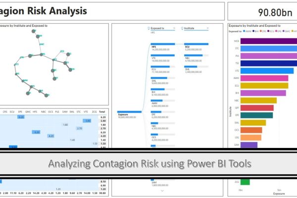
Analyzing Contagion Risk using Power BI Dashboard

Admin1 year ago1 year ago01 mins

This tutorial demonstrates how to analyze and visualize contagion risk among 20 financial institutions using Power BI Desktop. Contagion risk,…

Read More
  • Looker Studio

Looker Studio: Creating Responsive Reports in Looker Studio using Responsive Layout

Admin1 year ago1 year ago02 mins

This tutorial introduces how to create a responsive dashboard in Google Looker Studio, a feature that allows dashboards to automatically…

Read More
  • Looker Studio

Looker Studio: Simplify Creating Reports Using Datasets with Multiple CSV Files

Admin1 year ago1 year ago02 mins

This tutorial demonstrates how to leverage multiple CSV files to construct a unified dashboard or report in Looker Studio. The…

Read More
  • MS Excel
  • SQL

Excel & SQL Server Integration: Effortless Data Analysis, Visualization and Reporting

Admin1 year ago1 year ago03 mins

Tired of wrestling with complex SQL queries just to analyze your data? Welcome to this comprehensive tutorial where we’ll unlock…

Read More
  • 1
  • 2
  • 3
  • 4
  • …
  • 12
Log in
  • Apps (1)
  • Resources (1)
    • Datasets (1)
  • Topics (12)
    • Data Analysis Expression (DAX) (3)
      • Complete List of DAX Functions (2)
    • Google Looker Studio (3)
      • Complete Guide to the Looker Studio (1)
    • MS Excel (1)
      • Mastering MS Excel (1)
    • Power BI (1)
    • Python (4)
      • Python Complete Course (4)
  • Uncategorized (1)
  • Video Tutorials (311)
    • C# (1)
    • DAX (10)
    • Google Charts (2)
    • HTML (8)
    • JavaScript (8)
    • Looker Studio (12)
    • Maths (1)
    • MS Access (1)
    • MS Excel (61)
    • MS Power Point (3)
    • Other (1)
    • Power Apps (1)
    • Power Automate (4)
    • Power BI (147)
    • Power Query (M Language) (4)
    • Python (55)
    • Quiz (1)
    • R (3)
    • SQL (32)
    • Tableau (1)
    • Unity3d (1)
    • Windows PowerShell (1)

Recent Posts

  • Learn By Example: Python File Organizer – Learn Windows Automation using os, shutil, and pathlib
  • Data Analysis with R: Tutorial for Beginners – Want to Learn Data Analysis with R, Start Here
  • Power BI: Say Goodbye to Complex DAX – Visual Calculations Made Easy
  • The Ten-Digit Empire: How Human Anatomy Built the Modern World (Base 10 System)
  • PowerPoint: Creating Automated Dynamic Presentations with SQL Server Data Integration using Excel

Recent Comments

  1. Admin on Power BI: Monitor Risk using Capital Adequacy and Risk Weighted Assets Dashboard
  2. Augustine Ahiatsi on Power BI: Monitor Risk using Capital Adequacy and Risk Weighted Assets Dashboard

Popular

1

Learn By Example: Python File Organizer – Learn Windows Automation using os, shutil, and pathlib

  • Python
2

Data Analysis with R: Tutorial for Beginners – Want to Learn Data Analysis with R, Start Here

  • R
3

Power BI: Say Goodbye to Complex DAX – Visual Calculations Made Easy

  • Power BI
4

The Ten-Digit Empire: How Human Anatomy Built the Modern World (Base 10 System)

  • Maths
5

PowerPoint: Creating Automated Dynamic Presentations with SQL Server Data Integration using Excel

  • MS Excel
  • MS Power Point
6

PowerShell Lesson 001 Mastering the Environment and Creating your first Script

  • Windows PowerShell
7

SQL: Unlock SQL Server’s Brain! The Master Database Tutorial including Critical Admin Commands

  • SQL
8

Power BI: Fleet Performance Logistics Dashboard with Driver Safety, Efficiency, and Compliace KPIs

  • Power BI

Copyright 2025 virtual-school.org