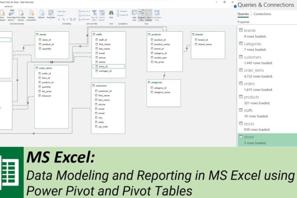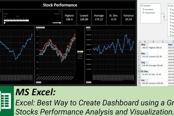
Best Way to Create Dashboard using a Grid – Stocks Performance Analysis and Visualization

Welcome to our MS Excel dashboard tutorial where we’ll guide you through creating an insightful stock performance dashboard using power pivot, pivot tables, slicer, and timeline. In this tutorial, we’ll show you how to: #ExcelTutorial #DataAnalysis #DashboardDesign #StockPerformance #TechCompanies #PowerPivot #PivotTables #Slicer #Timeline #DataModel #MicrosoftExcel #FinancialAnalysis #DataVisualization #StockMarket #Meta #Google #Microsoft #Apple #DataVisualization #Tutorial #SubscribeNow…
Read More

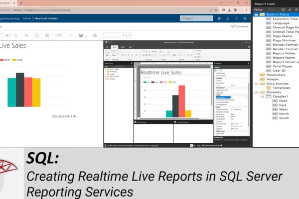
Creating Realtime Live Reports in SQL Server Reporting Services

How to Install and Configure SQL Server Reporting Services (SSRS): https://youtu.be/o4-Fztiov1E Welcome to another SQL Server tutorial. In today’s session, we’ll guide you through the process of connecting your SQL Server database to SQL Server Reporting Services, allowing you to display live, real-time information in a dynamic report. In our previous tutorial, we covered the…

Read More

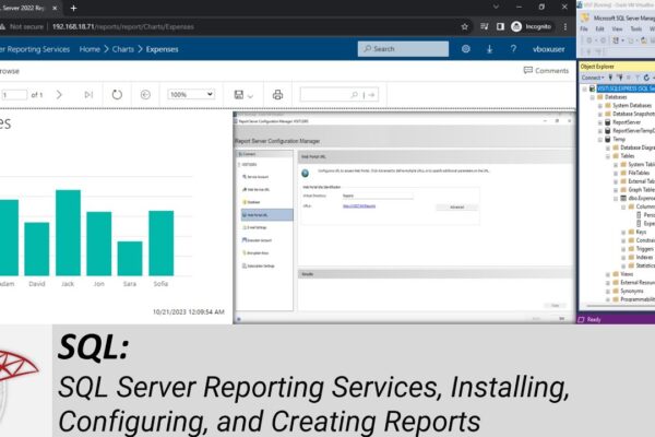
SQL Server Reporting Services, Installing, Configuring, and Creating Reports, for Beginners

Welcome to our YouTube tutorial on SQL Server Reporting Services, Microsoft’s powerful server-based report generating software. In this tutorial, we guide you through the process of downloading, installing, and configuring SQL Server Reporting Services, alongside SQL Server and SQL Server Management Studio. We start by explaining the prerequisites, detailing the installation steps for each component,…

Read More

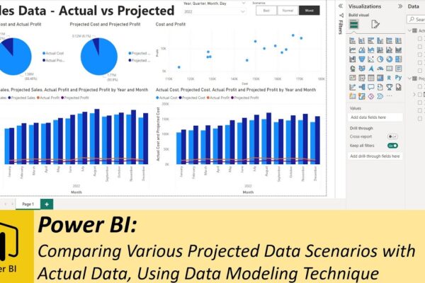
Comparing Various Projected Data Scenarios with Actual Data, Using Data Modeling Technique

In this tutorial, we’re delving into the world of data analysis using Excel and Power BI. We have an Excel file containing both projected and actual sales data, and we’ll guide you through the process of creating an informative dashboard to compare different sales scenarios with the actual data. We’ll cover everything from importing data…

Read More