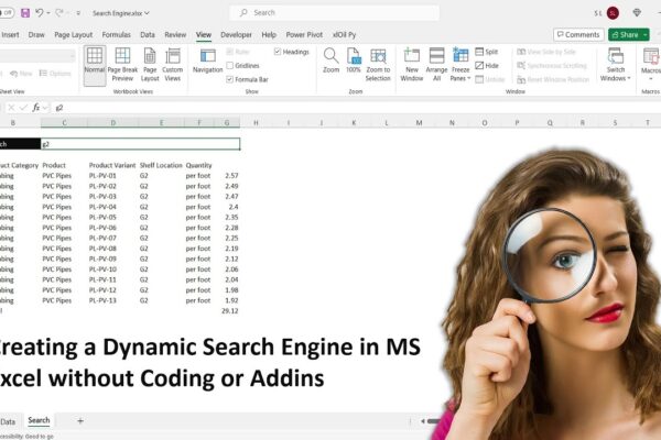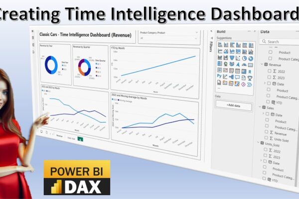
Time Intelligence in Power BI: A Visual Guide

This video tutorial introduces time intelligence calculations and their visualization using Power BI dashboards. It covers various time intelligence concepts, including time series, time bucketing, year-over-year comparison, moving averages, and year-to-date analysis. The tutorial demonstrates how to import data into Power BI, create different visualizations like pie charts and line charts, and perform calculations to…

Read More

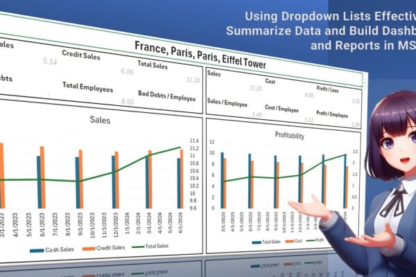
Using Dropdown Lists Effectively to Summarize Data and Build Dashboards and Reports in MS Excel

The video tutorial demonstrates how to create a comprehensive report in MS Excel using a drop-down list. The tutorial begins by explaining how to set up a data set with quarterly sales information, including location details. It then guides viewers through the process of creating a drop-down list, which allows users to select specific countries,…

Read More

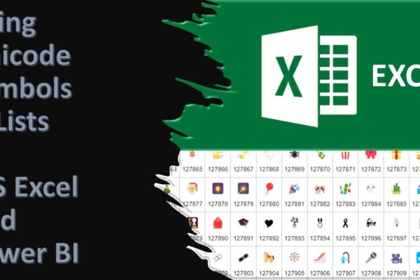
Using Unicode Symbols in Excel and Power BI and Converting Symbols to Code and Back in Excel

Unicode characters are a special coding system that allows computers to display a vast variety of text and symbols from different languages. These characters are not images, but they can be used to represent images and even create fancy lists and other visual elements within your spreadsheets or dashboards. There are different Unicode codes for…

Read More

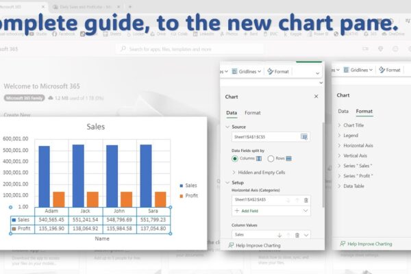
Complete Guide to the New Chart Pane in Excel Online

This video tutorial will guide you through using the new chart pane in Microsoft Excel Online to format and style your charts. What you’ll learn:Accessing the chart paneFormatting chart elements (title, legend, axis, gridlines)Data label optionsAdding error barsUsing trendlinesData table settings Video Outline:We’ll use sample data to create a chart.Pivot tables won’t work with the…

Read More

Performing Comparative Analysis by Pivoting Columns in Power Query

In this power BI visualization tutorial, we focus on comparing sales data from a vertical dataset across different years. Beginning with data transformation in the Power Query Editor, we progress to creating a comparative visual for a dashboard. Step by step, we navigate through loading data, adding visual elements like text boxes and line charts,…

Read More

Forecasting with Seasonal Autoregressive Integrated Moving Average (SARIMA) in Python/Excel

In this Python forecasting tutorial, we delve into predicting future global temperature changes using the SARIMA model, utilizing both Python and MS Excel. We start by acquiring data from NASA’s global climate change website and loading it into Python using the Pandas library. After cleaning and formatting the data, we construct our SARIMA model, setting…

Read More