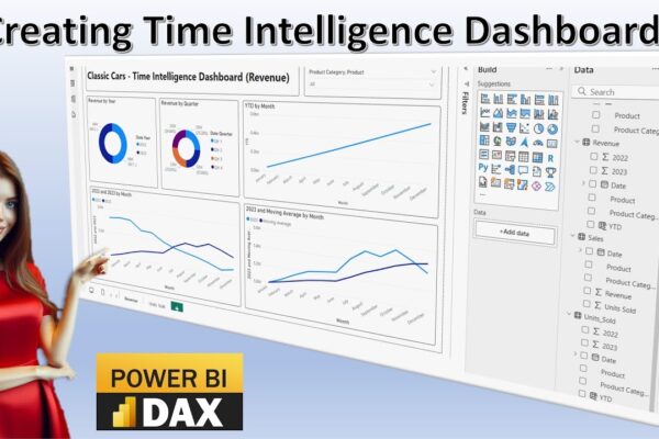
Time Intelligence in Power BI: A Visual Guide

This video tutorial introduces time intelligence calculations and their visualization using Power BI dashboards. It covers various time intelligence concepts, including time series, time bucketing, year-over-year comparison, moving averages, and year-to-date analysis. The tutorial demonstrates how to import data into Power BI, create different visualizations like pie charts and line charts, and perform calculations to…

Read More

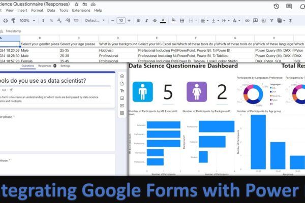
Analyse and Visualize Google Forms Responses using Power BI by Integrating Forms with Power BI

This tutorial demonstrates how to integrate Google Forms responses with Power BI Desktop to create interactive visualizations. It covers creating a Google Form, collecting responses, and connecting the resulting spreadsheet to Power BI. The video then walks through building a dashboard with various charts to analyze the collected data, including using AI to calculate values…

Read More

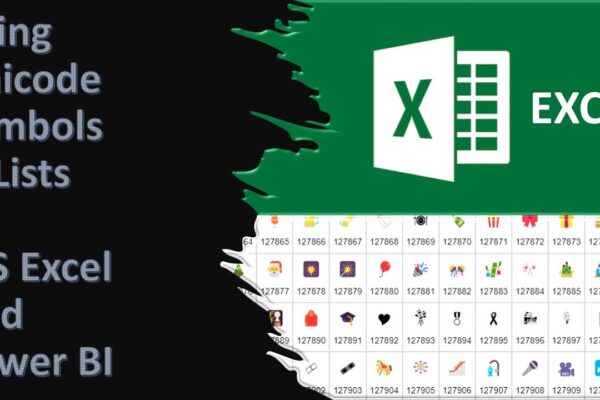
Using Unicode Symbols in Excel and Power BI and Converting Symbols to Code and Back in Excel

Unicode characters are a special coding system that allows computers to display a vast variety of text and symbols from different languages. These characters are not images, but they can be used to represent images and even create fancy lists and other visual elements within your spreadsheets or dashboards. There are different Unicode codes for…

Read More

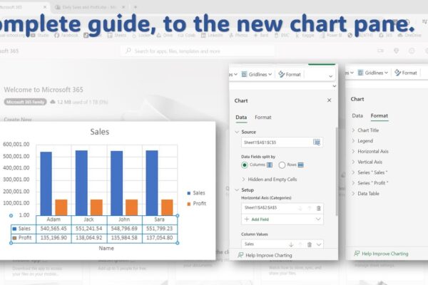
Complete Guide to the New Chart Pane in Excel Online

This video tutorial will guide you through using the new chart pane in Microsoft Excel Online to format and style your charts. What you’ll learn:Accessing the chart paneFormatting chart elements (title, legend, axis, gridlines)Data label optionsAdding error barsUsing trendlinesData table settings Video Outline:We’ll use sample data to create a chart.Pivot tables won’t work with the…

Read More

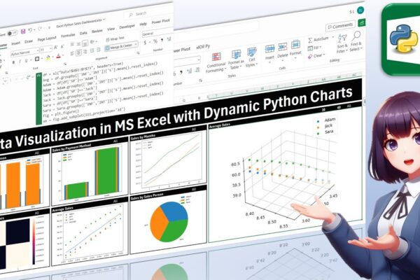
Data Visualization in MS Excel with Dynamic Python Charts

Welcome back, everyone! In this unique tutorial, we’ll guide you through creating a dynamic dashboard in Microsoft Excel using Python. Specifically tailored for those keen on mastering Python visualizations, we’ll delve into the world of Excel charts powered by Python’s Matplotlib library. Notably, unlike Excel’s native charts, Python charts seamlessly integrate within cells, providing a…

Read More