Skip to content
Monday, May 25, 2026
  • Power BI: Say Goodbye to Complex DAX – Visual Calculations Made Easy
  • The Ten-Digit Empire: How Human Anatomy Built the Modern World (Base 10 System)
  • PowerPoint: Creating Automated Dynamic Presentations with SQL Server Data Integration using Excel
  • PowerShell Lesson 001 Mastering the Environment and Creating your first Script

Virtual School

This Week
Log in
  • Home
  • Topics
  • Video Tutorials
  • Resources
  • Home
  • Topics
  • Video Tutorials
  • Resources
  • Power BI: Say Goodbye to Complex DAX – Visual Calculations Made Easy
  • The Ten-Digit Empire: How Human Anatomy Built the Modern World (Base 10 System)
  • PowerPoint: Creating Automated Dynamic Presentations with SQL Server Data Integration using Excel
  • PowerShell Lesson 001 Mastering the Environment and Creating your first Script

Virtual School

This Week
  • Home
  • Topics
  • Video Tutorials
  • Resources
  • Power BI: Say Goodbye to Complex DAX – Visual Calculations Made Easy

    18 hours ago18 hours ago
  • The Ten-Digit Empire: How Human Anatomy Built the Modern World (Base 10 System)

    1 week ago1 week ago
  • PowerPoint: Creating Automated Dynamic Presentations with SQL Server Data Integration using Excel

    2 weeks ago2 weeks ago
  • PowerShell Lesson 001 Mastering the Environment and Creating your first Script

    4 weeks ago4 weeks ago
  • SQL: Unlock SQL Server’s Brain! The Master Database Tutorial including Critical Admin Commands

    2 months ago2 months ago
  • Power BI: Fleet Performance Logistics Dashboard with Driver Safety, Efficiency, and Compliace KPIs

    2 months ago2 months ago
  • How to define functions in Python: A complete guide for Beginners

    3 months ago3 months ago
  • Python Control Flow Mastery: Interruptions and Iteration for Beginners

    3 months ago3 months ago
  • Python: What is range() function in Python and how to use it? A Guide for Beginners

    3 months ago3 months ago
  • The Foundation of Data: Sourcing, Structuring, and Importing with Python for Beginners

    4 months ago4 months ago
  • Home
  • dataanalysis
  • Page 3

dataanalysis

  • Power BI

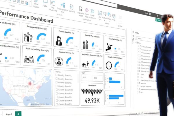
Creating a Stunning HR Performance Dashboard using Images and Slicers and Visuals

Admin2 years ago1 year ago01 mins

This video tutorial creates a beautiful HR performance dashboard in Power BI. The dashboard will include KPIs (Key Performance Indicators)…

Read More
  • DAX
  • Power BI

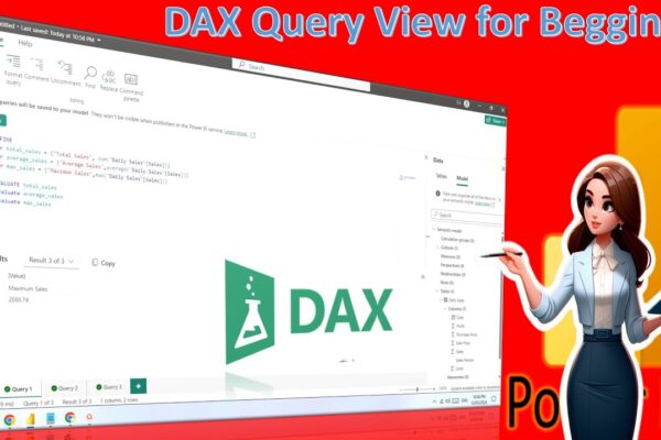
Power BI: DAX Query View for Beginners – Supercharge Your Dashboards with DAX Query View

Admin2 years ago1 year ago01 mins

The video is about creating a dashboard and exploring Dax query view in Power BI. The speaker first introduces the…

Read More
  • MS Excel

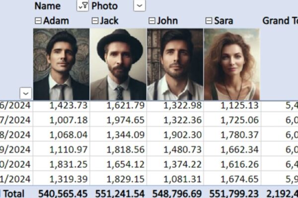
Using Images in Pivot Tables, a new added Feature by Microsoft

Admin2 years ago1 year ago01 mins

This video tutorial is about creating pivot tables with images in Microsoft Excel, a newly introduced feature. It walks you…

Read More
  • Power BI

Creating Dashboards for Mobile Devices

Admin2 years ago1 year ago01 mins

This video tutorial is about creating a mobile-friendly dashboard in Power BI. It starts by guiding you through how to…

Read More
  • MS Excel

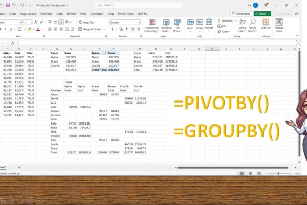
Complete Guide to use Groupby and Pivotby functions newly introduced by Microsoft

Admin2 years ago1 year ago01 mins

In this tutorial, we explore the newly introduced Pivot By and Group By functions in Microsoft Excel. Learn how to…

Read More
  • MS Excel
  • Python

Using Python Real Time Data Server to Display information in MS Excel

Admin2 years ago1 year ago02 mins

Welcome to another tutorial on real-time data in MS Excel! In our previous sessions, we explored building add-ins in VBA…

Read More
  • Power BI

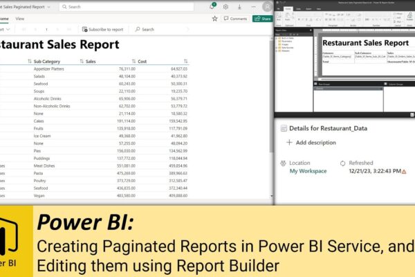
Creating Paginated Reports in Power BI Service, and Editing them using Report Builder

Admin2 years ago1 year ago02 mins

Welcome back to our Power BI journey! In our previous videos, we uploaded data to our Power BI workspace and…

Read More
  • Power BI

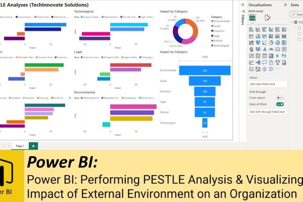
Performing PESTLE Analysis & Visualizing Impact of External Environment on an Organization

Admin2 years ago1 year ago01 mins

Welcome to our tutorial on building a PESTLE analysis dashboard using Power BI! In this video, we delve into the…

Read More
  • Power BI

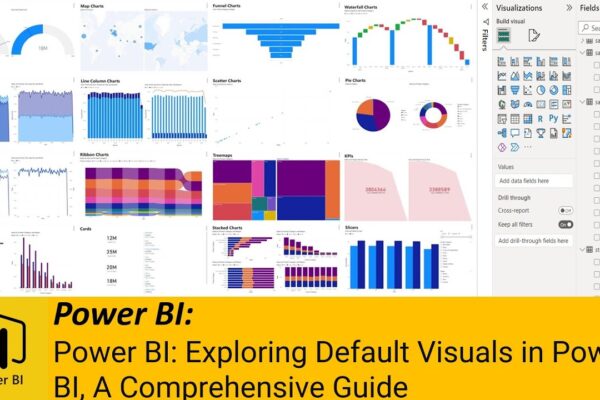
Exploring Default Visuals in Power BI, A Comprehensive Guide

Admin3 years ago1 year ago02 mins

The video is about exploring the default visuals in Power BI, which is a business intelligence tool used for data…

Read More
  • MS Excel

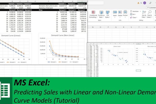
Predicting Sales with Linear and Non-Linear Demand Curve Models

Admin3 years ago1 year ago02 mins

In this video, the presenter is discussing how to predict sales or demand through linear and non-linear prediction models based…

Read More
  • 1
  • 2
  • 3
  • 4
Log in
  • Apps (1)
  • Resources (1)
    • Datasets (1)
  • Topics (12)
    • Data Analysis Expression (DAX) (3)
      • Complete List of DAX Functions (2)
    • Google Looker Studio (3)
      • Complete Guide to the Looker Studio (1)
    • MS Excel (1)
      • Mastering MS Excel (1)
    • Power BI (1)
    • Python (4)
      • Python Complete Course (4)
  • Uncategorized (1)
  • Video Tutorials (309)
    • C# (1)
    • DAX (10)
    • Google Charts (2)
    • HTML (8)
    • JavaScript (8)
    • Looker Studio (12)
    • Maths (1)
    • MS Access (1)
    • MS Excel (61)
    • MS Power Point (3)
    • Other (1)
    • Power Apps (1)
    • Power Automate (4)
    • Power BI (147)
    • Power Query (M Language) (4)
    • Python (54)
    • Quiz (1)
    • R (2)
    • SQL (32)
    • Tableau (1)
    • Unity3d (1)
    • Windows PowerShell (1)

Recent Posts

  • Power BI: Say Goodbye to Complex DAX – Visual Calculations Made Easy
  • The Ten-Digit Empire: How Human Anatomy Built the Modern World (Base 10 System)
  • PowerPoint: Creating Automated Dynamic Presentations with SQL Server Data Integration using Excel
  • PowerShell Lesson 001 Mastering the Environment and Creating your first Script
  • SQL: Unlock SQL Server’s Brain! The Master Database Tutorial including Critical Admin Commands

Recent Comments

  1. Admin on Power BI: Monitor Risk using Capital Adequacy and Risk Weighted Assets Dashboard
  2. Augustine Ahiatsi on Power BI: Monitor Risk using Capital Adequacy and Risk Weighted Assets Dashboard

Popular

1

Power BI: Say Goodbye to Complex DAX – Visual Calculations Made Easy

  • Power BI
2

The Ten-Digit Empire: How Human Anatomy Built the Modern World (Base 10 System)

  • Maths
3

PowerPoint: Creating Automated Dynamic Presentations with SQL Server Data Integration using Excel

  • MS Excel
  • MS Power Point
4

PowerShell Lesson 001 Mastering the Environment and Creating your first Script

  • Windows PowerShell
5

SQL: Unlock SQL Server’s Brain! The Master Database Tutorial including Critical Admin Commands

  • SQL
6

Power BI: Fleet Performance Logistics Dashboard with Driver Safety, Efficiency, and Compliace KPIs

  • Power BI
7

How to define functions in Python: A complete guide for Beginners

  • Python
8

Python Control Flow Mastery: Interruptions and Iteration for Beginners

  • Python

Copyright 2025 virtual-school.org