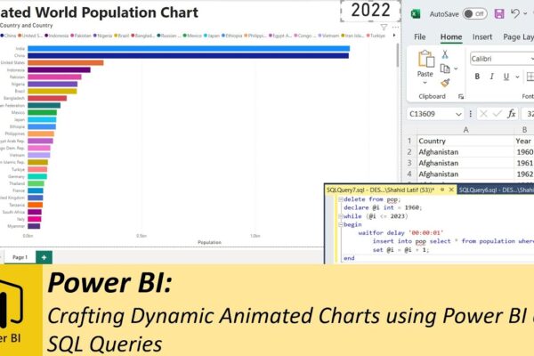
Crafting Dynamic Animated Charts using Power BI and SQL Queries
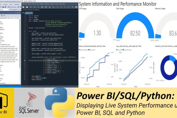
Welcome to our tutorial where we’ll guide you through the process of creating an animated bar chart using Power BI and SQL queries. In this narrative journey, we’ll harness the power of SQL Server database to display world population data on an engaging bar chart. To begin, we’ll leverage SQL queries to animate a normal…