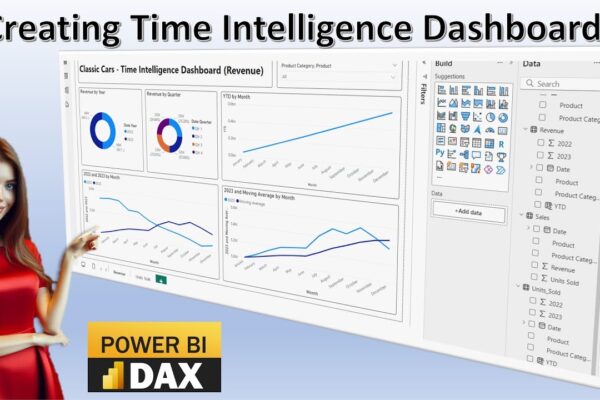
Time Intelligence in Power BI: A Visual Guide

This video tutorial introduces time intelligence calculations and their visualization using Power BI dashboards. It covers various time intelligence concepts, including time series, time bucketing, year-over-year comparison, moving averages, and year-to-date analysis. The tutorial demonstrates how to import data into Power BI, create different visualizations like pie charts and line charts, and perform calculations to…

Read More

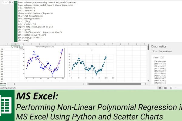
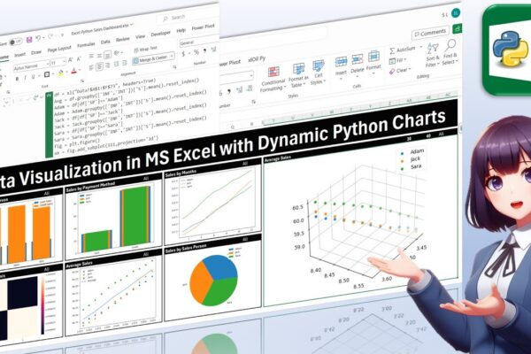
Data Visualization in MS Excel with Dynamic Python Charts

Welcome back, everyone! In this unique tutorial, we’ll guide you through creating a dynamic dashboard in Microsoft Excel using Python. Specifically tailored for those keen on mastering Python visualizations, we’ll delve into the world of Excel charts powered by Python’s Matplotlib library. Notably, unlike Excel’s native charts, Python charts seamlessly integrate within cells, providing a…

Read More

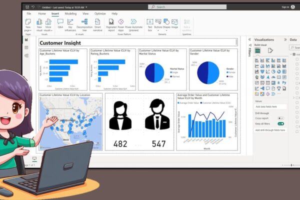
How to Create a Nice Customer Insight Dashboar in Power BI Desktop

In this tutorial, the presenter welcomes the audience back and introduces the creation of a customer insight dashboard using data available on Kaggle. The process involves creating age and rating buckets using Data Analysis Expression, exporting icons from PowerPoint, and incorporating them into the dashboard. The tutorial covers turning on map visuals, adjusting canvas size,…

Read More

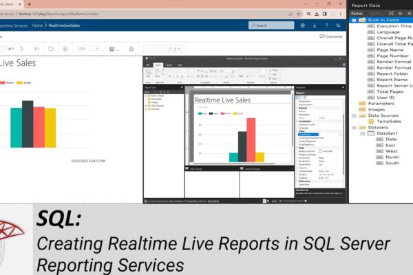
Creating Realtime Live Reports in SQL Server Reporting Services

How to Install and Configure SQL Server Reporting Services (SSRS): https://youtu.be/o4-Fztiov1E Welcome to another SQL Server tutorial. In today’s session, we’ll guide you through the process of connecting your SQL Server database to SQL Server Reporting Services, allowing you to display live, real-time information in a dynamic report. In our previous tutorial, we covered the…

Read More