win gagasol casinosweetyspin casinobaxterbet italiasweety spinluckystar aviatorneed for slots casinoslot exo casinospinaura casinomr pachowildrobinnine casino loginchickensubway gamebaxterbet casino login

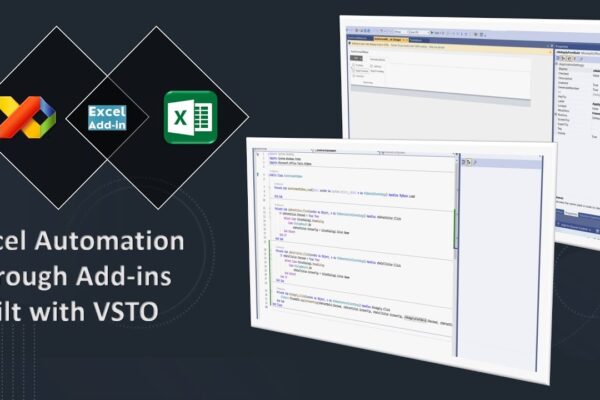
Build Your Own Excel Toolbars: Excel Automation with Add-in created in Visual Studio using VSTO

This video provides a step-by-step guide on creating a custom Excel add-in using Visual Basic for Applications (VB.NET) and Microsoft Visual Studio. It starts with setting up the project in Visual Studio, then walks you through designing the add-in ribbon with buttons and options for formatting. Next, you’ll learn how to code the functionality behind…

Read More

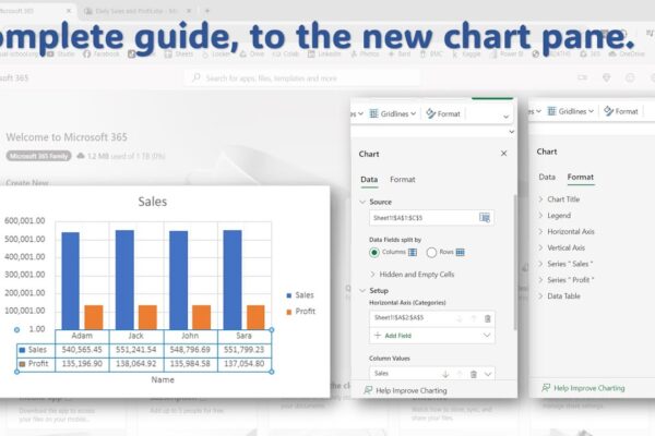
Complete Guide to the New Chart Pane in Excel Online

This video tutorial will guide you through using the new chart pane in Microsoft Excel Online to format and style your charts. What you’ll learn:Accessing the chart paneFormatting chart elements (title, legend, axis, gridlines)Data label optionsAdding error barsUsing trendlinesData table settings Video Outline:We’ll use sample data to create a chart.Pivot tables won’t work with the…

Read More

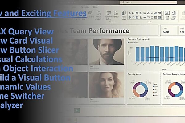
Using Latest Preview Features like Dax Query View, Visual Calculations and Button Slicers

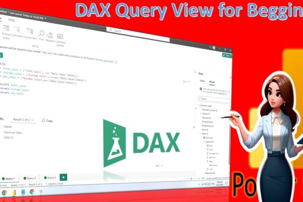
This Power BI tutorial introduces new features like DAX Query View, New Card Visual, New Button Slicer, Visual Calculations, On Object Interaction, Build a Visual Button, Dynamic Values, Pane Switcher, Analyzer, etc. It then demonstrates how to create a dashboard using these features, explaining each step along the way. The video covers connecting to data,…

Read More

Performing Comparative Analysis by Pivoting Columns in Power Query

In this power BI visualization tutorial, we focus on comparing sales data from a vertical dataset across different years. Beginning with data transformation in the Power Query Editor, we progress to creating a comparative visual for a dashboard. Step by step, we navigate through loading data, adding visual elements like text boxes and line charts,…

Read More