Skip to content
Thursday, July 30, 2026
North American Company
How to Fix Mapping Errors in Power BI (Accurate Location Data Tutorial)
Power BI: Build a Dynamic Risk Matrix Simulation in Power BI Using DAX & Parameters
Excel: How to Correct Wrong Date Formats in Seonds without using Complex Forumulas and Methods.

Virtual School

This Week
Log in
  • Home
  • Profile
  • Topics
  • Video Tutorials
  • Resources
  • Home
  • Profile
  • Topics
  • Video Tutorials
  • Resources
North American Company
How to Fix Mapping Errors in Power BI (Accurate Location Data Tutorial)
Power BI: Build a Dynamic Risk Matrix Simulation in Power BI Using DAX & Parameters
Excel: How to Correct Wrong Date Formats in Seonds without using Complex Forumulas and Methods.

Virtual School

This Week
  • Home
  • Profile
  • Topics
  • Video Tutorials
  • Resources

North American Company

12 hours ago12 hours ago

How to Fix Mapping Errors in Power BI (Accurate Location Data Tutorial)

1 day ago1 day ago

Power BI: Build a Dynamic Risk Matrix Simulation in Power BI Using DAX & Parameters

3 days ago3 days ago

Excel: How to Correct Wrong Date Formats in Seonds without using Complex Forumulas and Methods.

4 days ago4 days ago

Power BI Desktop: Creating Dashboard with 60,000 Plus Photos and Generating Dataset from file names

3 weeks ago3 weeks ago

Learn By Example: Python File Organizer – Learn Windows Automation using os, shutil, and pathlib

1 month ago1 month ago

Data Analysis with R: Tutorial for Beginners – Want to Learn Data Analysis with R, Start Here

2 months ago2 months ago

Power BI: Say Goodbye to Complex DAX – Visual Calculations Made Easy

2 months ago2 months ago

The Ten-Digit Empire: How Human Anatomy Built the Modern World (Base 10 System)

2 months ago2 months ago

PowerPoint: Creating Automated Dynamic Presentations with SQL Server Data Integration using Excel

3 months ago3 months ago
  • Python

How to calculate arithmetic median in MS Excel and display dataset on a chart

Shahid Latif5 years ago2 years ago01 mins

In this video tutorial we will show you how to calculate arithmetic median from a very simple dataset in MS Excel and how to display the same in a chart.

Read More
  • Python

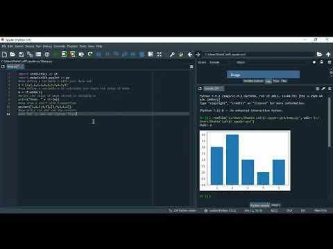
How to calculate arithmetic mode in Python and display dataset on a chart

Shahid Latif5 years ago2 years ago01 mins

In this video tutorial we will show you how to calculate arithmetic mode from a very simple dataset in Python and how to display the same in a chart.

Read More
  • Python

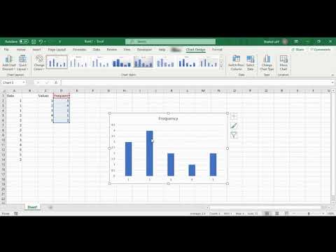
How to calculate arithmetic mean / average in Python and displaying dataset on a line chart

Shahid Latif5 years ago2 years ago01 mins

In this video tutorial we will show you how to calculate arithmetic mean or average from a very simple dataset in Python and how to display the same in a line chart.
Read More
  • MS Excel

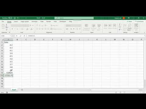
How to calculate arithmetic mean / average in MS Excel and display dataset on a line chart

Shahid Latif5 years ago2 years ago01 mins

In this video tutorial we will show you how to calculate arithmetic mean or average from a very simple dataset in MS Excel and how to display the same in a line chart.

Read More
  • 1
  • …
  • 31
  • 32
  • 33
Log in
  • Apps (1)
  • Resources (1)
    • Datasets (1)
  • Topics (12)
    • Data Analysis Expression (DAX) (3)
      • Complete List of DAX Functions (2)
    • Google Looker Studio (3)
      • Complete Guide to the Looker Studio (1)
    • MS Excel (1)
      • Mastering MS Excel (1)
    • Power BI (1)
    • Python (4)
      • Python Complete Course (4)
  • Uncategorized (2)
  • Video Tutorials (315)
    • C# (1)
    • DAX (10)
    • Google Charts (2)
    • HTML (8)
    • JavaScript (8)
    • Looker Studio (12)
    • Maths (1)
    • MS Access (1)
    • MS Excel (62)
    • MS Power Point (3)
    • Other (1)
    • Power Apps (1)
    • Power Automate (4)
    • Power BI (150)
    • Power Query (M Language) (4)
    • Python (55)
    • Quiz (1)
    • R (3)
    • SQL (32)
    • Tableau (1)
    • Unity3d (1)
    • Windows PowerShell (1)

Recent Posts

  • North American Company
  • How to Fix Mapping Errors in Power BI (Accurate Location Data Tutorial)
  • Power BI: Build a Dynamic Risk Matrix Simulation in Power BI Using DAX & Parameters
  • Excel: How to Correct Wrong Date Formats in Seonds without using Complex Forumulas and Methods.
  • Power BI Desktop: Creating Dashboard with 60,000 Plus Photos and Generating Dataset from file names

Recent Comments

  1. Admin on Complete Guide to the Looker Studio: Sharing Looker Studio Reports
  2. Nik A Hafiz on Complete Guide to the Looker Studio: Sharing Looker Studio Reports
  3. Admin on Power BI: Monitor Risk using Capital Adequacy and Risk Weighted Assets Dashboard
  4. Augustine Ahiatsi on Power BI: Monitor Risk using Capital Adequacy and Risk Weighted Assets Dashboard

Popular

1

North American Company

  • Uncategorized
2

How to Fix Mapping Errors in Power BI (Accurate Location Data Tutorial)

  • Power BI
3

Power BI: Build a Dynamic Risk Matrix Simulation in Power BI Using DAX & Parameters

  • Power BI
4

Excel: How to Correct Wrong Date Formats in Seonds without using Complex Forumulas and Methods.

  • MS Excel
5

Power BI Desktop: Creating Dashboard with 60,000 Plus Photos and Generating Dataset from file names

  • Power BI
6

Learn By Example: Python File Organizer – Learn Windows Automation using os, shutil, and pathlib

  • Python
7

Data Analysis with R: Tutorial for Beginners – Want to Learn Data Analysis with R, Start Here

  • R
8

Power BI: Say Goodbye to Complex DAX – Visual Calculations Made Easy

  • Power BI

Copyright 2025 virtual-school.org