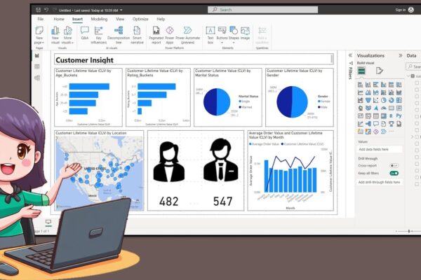
How to Create a Nice Customer Insight Dashboar in Power BI Desktop

In this tutorial, the presenter welcomes the audience back and introduces the creation of a customer insight dashboard using data available on Kaggle. The process involves creating age and rating buckets using Data Analysis Expression, exporting icons from PowerPoint, and incorporating them into the dashboard. The tutorial covers turning on map visuals, adjusting canvas size,…

Read More

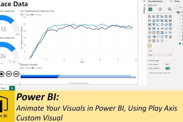
Animate Your Visuals in Power BI, Using Play Axis Custom Visual

Previously, we explored various methods for animating your dashboards using SQL. Whether you want to display real-time data or historical data animations, SQL method works great. However you’ll discover that SQL isn’t always necessary, especially when dealing with historical data. Instead, we introduce you to a handy custom visual known as “play axis,” available for…

Read More