


Skip to content
Wednesday, September 16, 2026
Power Query vs DAX for Beginners: When to Use Which in Power BI?
How to Peform YoY Comparison in Power BI – For Begginers
Complete Power BI Tutorial with Custom Graphics, Animated Background, Dynamic Values and Much More – Global E-Commerce Supply Chain
North American Company

Virtual School

This Week
  • Home
  • Profile
  • Topics
  • Video Tutorials
  • Resources
Power Query vs DAX for Beginners: When to Use Which in Power BI?
How to Peform YoY Comparison in Power BI – For Begginers
Complete Power BI Tutorial with Custom Graphics, Animated Background, Dynamic Values and Much More – Global E-Commerce Supply Chain
North American Company

Virtual School

This Week
  • Home
  • Profile
  • Topics
  • Video Tutorials
  • Resources

Power Query vs DAX for Beginners: When to Use Which in Power BI?

1 week ago1 week ago

How to Peform YoY Comparison in Power BI – For Begginers

3 weeks ago3 weeks ago

Complete Power BI Tutorial with Custom Graphics, Animated Background, Dynamic Values and Much More – Global E-Commerce Supply Chain

1 month ago1 month ago

North American Company

2 months ago2 months ago

How to Fix Mapping Errors in Power BI (Accurate Location Data Tutorial)

2 months ago2 months ago

Power BI: Build a Dynamic Risk Matrix Simulation in Power BI Using DAX & Parameters

2 months ago2 months ago

Excel: How to Correct Wrong Date Formats in Seonds without using Complex Forumulas and Methods.

2 months ago2 months ago

Power BI Desktop: Creating Dashboard with 60,000 Plus Photos and Generating Dataset from file names

2 months ago2 months ago

Learn By Example: Python File Organizer – Learn Windows Automation using os, shutil, and pathlib

3 months ago3 months ago

Data Analysis with R: Tutorial for Beginners – Want to Learn Data Analysis with R, Start Here

3 months ago3 months ago
  • Home
  • Statistics

Statistics

  • Power BI

What is Box and Whisker Chart? And How to Create One in Power BI?

Shahid Latif9 months ago9 months ago02 mins

In this tutorial, we dive into the powerful world of statistical data visualization by building a comprehensive sales dashboard in Power BI. The star of the show is the Box and Whisker chart, a custom visual that provides a deep dive into your data’s distribution, including minimum and maximum values, quartiles ($Q1$ and $Q3$), the…
Read More
  • Power BI
  • Python

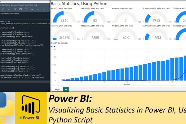
Visualizing Basic Statistics in Power BI, Using Python Script

Shahid Latif3 years ago2 years ago02 mins

In this video, the presenter demonstrates how to calculate basic statistics using Python script in Power BI and create a dashboard from those statistics using Power BI visuals. The video starts with importing the Pandas library and reading data from an Excel file into a data frame. The presenter then calculates mean, mode, median, standard…

Read More
  • MS Excel

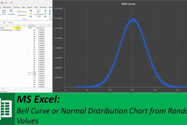
Creating a Bell Curve in Microsoft Excel: A Step-by-Step Tutorial

Shahid Latif4 years ago2 years ago01 mins

In this video, the steps to create a bell curve using Microsoft Excel are demonstrated. A column named “Data” is created. 500 random values are generated between 100 and 200 using the “RANDBETWEEN” formula and entered into the “Data” column. The mean and standard deviation of these 500 values are calculated using the “AVERAGE” and…

Read More
Log in
  • Apps (1)
  • Resources (1)
    • Datasets (1)
  • Topics (12)
    • Data Analysis Expression (DAX) (3)
      • Complete List of DAX Functions (2)
    • Google Looker Studio (3)
      • Complete Guide to the Looker Studio (1)
    • MS Excel (1)
      • Mastering MS Excel (1)
    • Power BI (1)
    • Python (4)
      • Python Complete Course (4)
  • Uncategorized (2)
  • Video Tutorials (318)
    • C# (1)
    • DAX (10)
    • Google Charts (2)
    • HTML (8)
    • JavaScript (8)
    • Looker Studio (12)
    • Maths (1)
    • MS Access (1)
    • MS Excel (62)
    • MS Power Point (3)
    • Other (1)
    • Power Apps (1)
    • Power Automate (4)
    • Power BI (153)
    • Power Query (M Language) (4)
    • Python (55)
    • Quiz (1)
    • R (3)
    • SQL (32)
    • Tableau (1)
    • Unity3d (1)
    • Windows PowerShell (1)

Recent Posts

  • Power Query vs DAX for Beginners: When to Use Which in Power BI?
  • How to Peform YoY Comparison in Power BI – For Begginers
  • Complete Power BI Tutorial with Custom Graphics, Animated Background, Dynamic Values and Much More – Global E-Commerce Supply Chain
  • North American Company
  • How to Fix Mapping Errors in Power BI (Accurate Location Data Tutorial)

Recent Comments

  1. Admin on Complete Guide to the Looker Studio: Sharing Looker Studio Reports
  2. Nik A Hafiz on Complete Guide to the Looker Studio: Sharing Looker Studio Reports
  3. Admin on Power BI: Monitor Risk using Capital Adequacy and Risk Weighted Assets Dashboard
  4. Augustine Ahiatsi on Power BI: Monitor Risk using Capital Adequacy and Risk Weighted Assets Dashboard
Log in
  • Home
  • Profile
  • Topics
  • Video Tutorials
  • Resources

Copyright 2025 virtual-school.org