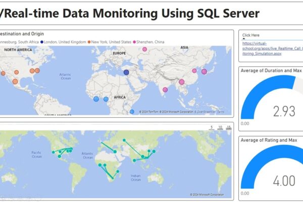
Real time Monitoring with Power BI and SQL
This video tutorial demonstrates how to set up a real-time call center monitoring dashboard using Power BI and SQL Server….

This video tutorial demonstrates how to set up a real-time call center monitoring dashboard using Power BI and SQL Server….
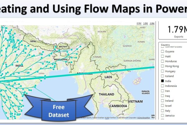
This tutorial explains how to create a flow map visualization in Power BI to show product exports from China to…

This video tutorial demonstrates how to use Power BI to perform a weighted decision matrix analysis on a set of…
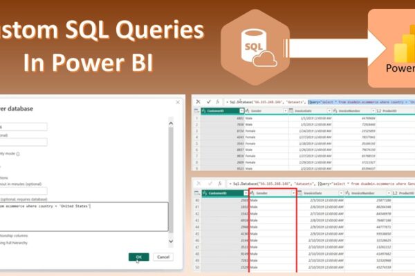
This tutorial explains how to use custom SQL queries in Power BI to manipulate data before loading it. It covers…
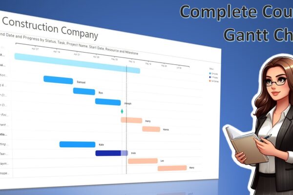
This video tutorial explains how to create a Gantt chart in Power BI. It walks you through the data required,…
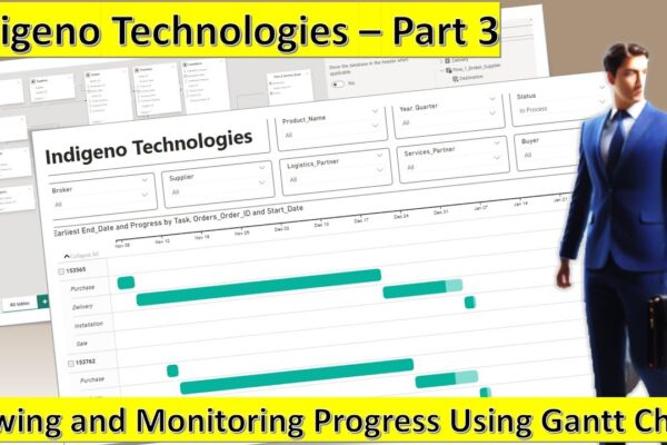
This video is part of a multi-part tutorial on using Power BI with a dataset called Indigino Technologies. In this…

This tutorial creates a data model and visualizes a flow of orders in Power BI. Here’s a summary: – We…
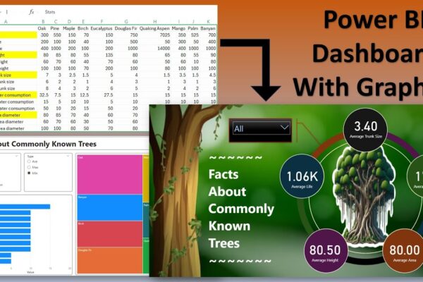
This is a video tutorial about creating a report on tree statistics using Power BI. The video covers how to…
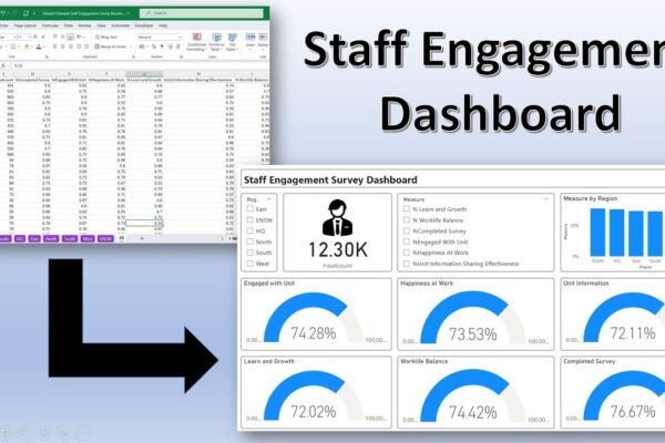
This video describes how to create a staff engagement dashboard in Power BI Desktop using sample staff engagement survey data….
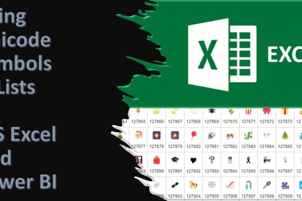
Unicode characters are a special coding system that allows computers to display a vast variety of text and symbols from…