






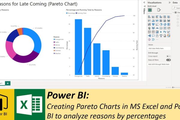
Creating Pareto Charts in MS Excel and Power BI to analyze reasons by percentages
The video is a tutorial on how to use Pareto Charts in MS Excel and Power BI to analyze a hypothetical problem. The problem that is being analyzed is the reasons why people are late to their office. The video explains that a Pareto chart is a combination of bars and lines that displays percentages…