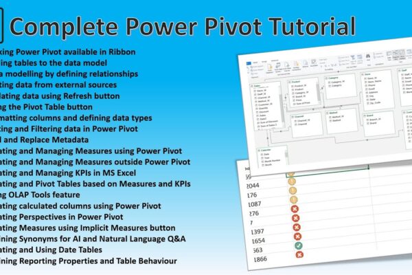
Power Pivot Advanced Concepts – A Complete Guide to Power Pivot

This tutorial provides a comprehensive overview of Power Pivot in Excel, covering topics such as data modeling, creating relationships, working with measures and KPIs, using OLAP tools, calculated columns, perspectives, and synonyms. It also demonstrates how to enable Power Pivot, connect to external data sources, and create pivot tables and charts. Additionally, the tutorial explains…
Read More

Using Unicode Symbols in Excel and Power BI and Converting Symbols to Code and Back in Excel

Unicode characters are a special coding system that allows computers to display a vast variety of text and symbols from different languages. These characters are not images, but they can be used to represent images and even create fancy lists and other visual elements within your spreadsheets or dashboards. There are different Unicode codes for…

Read More

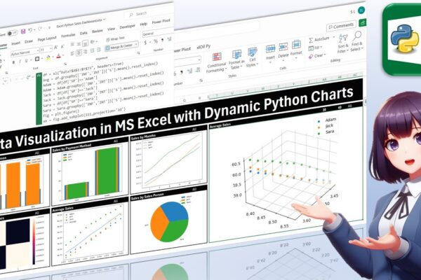
Data Visualization in MS Excel with Dynamic Python Charts

Welcome back, everyone! In this unique tutorial, we’ll guide you through creating a dynamic dashboard in Microsoft Excel using Python. Specifically tailored for those keen on mastering Python visualizations, we’ll delve into the world of Excel charts powered by Python’s Matplotlib library. Notably, unlike Excel’s native charts, Python charts seamlessly integrate within cells, providing a…

Read More

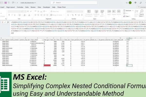
Simplifying Complex Nested Conditional Formulas using Easy and Understandable Method

In this tutorial, we’ll show you how to write a large, complex, nested conditional formula in Microsoft Excel, but in a simple and understandable manner. We’ll guide you through the process of adding multiple conditions using a straightforward technique that minimizes the risk of errors and confusion. Using a practical example with a credit dataset,…

Read More