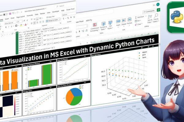
Data Visualization in MS Excel with Dynamic Python Charts

Welcome back, everyone! In this unique tutorial, we’ll guide you through creating a dynamic dashboard in Microsoft Excel using Python. Specifically tailored for those keen on mastering Python visualizations, we’ll delve into the world of Excel charts powered by Python’s Matplotlib library. Notably, unlike Excel’s native charts, Python charts seamlessly integrate within cells, providing a…

Read More

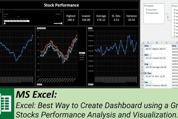
Best Way to Create Dashboard using a Grid – Stocks Performance Analysis and Visualization

Welcome to our MS Excel dashboard tutorial where we’ll guide you through creating an insightful stock performance dashboard using power pivot, pivot tables, slicer, and timeline. In this tutorial, we’ll show you how to: #ExcelTutorial #DataAnalysis #DashboardDesign #StockPerformance #TechCompanies #PowerPivot #PivotTables #Slicer #Timeline #DataModel #MicrosoftExcel #FinancialAnalysis #DataVisualization #StockMarket #Meta #Google #Microsoft #Apple #DataVisualization #Tutorial #SubscribeNow…

Read More

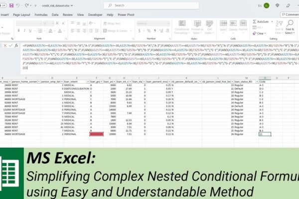
Simplifying Complex Nested Conditional Formulas using Easy and Understandable Method

In this tutorial, we’ll show you how to write a large, complex, nested conditional formula in Microsoft Excel, but in a simple and understandable manner. We’ll guide you through the process of adding multiple conditions using a straightforward technique that minimizes the risk of errors and confusion. Using a practical example with a credit dataset,…

Read More