Skip to content
Monday, May 25, 2026
  • Power BI: Say Goodbye to Complex DAX – Visual Calculations Made Easy
  • The Ten-Digit Empire: How Human Anatomy Built the Modern World (Base 10 System)
  • PowerPoint: Creating Automated Dynamic Presentations with SQL Server Data Integration using Excel
  • PowerShell Lesson 001 Mastering the Environment and Creating your first Script

Virtual School

This Week
Log in
  • Home
  • Topics
  • Video Tutorials
  • Resources
  • Home
  • Topics
  • Video Tutorials
  • Resources
  • Power BI: Say Goodbye to Complex DAX – Visual Calculations Made Easy
  • The Ten-Digit Empire: How Human Anatomy Built the Modern World (Base 10 System)
  • PowerPoint: Creating Automated Dynamic Presentations with SQL Server Data Integration using Excel
  • PowerShell Lesson 001 Mastering the Environment and Creating your first Script

Virtual School

This Week
  • Home
  • Topics
  • Video Tutorials
  • Resources
  • Power BI: Say Goodbye to Complex DAX – Visual Calculations Made Easy

    5 hours ago5 hours ago
  • The Ten-Digit Empire: How Human Anatomy Built the Modern World (Base 10 System)

    1 week ago1 week ago
  • PowerPoint: Creating Automated Dynamic Presentations with SQL Server Data Integration using Excel

    2 weeks ago2 weeks ago
  • PowerShell Lesson 001 Mastering the Environment and Creating your first Script

    4 weeks ago4 weeks ago
  • SQL: Unlock SQL Server’s Brain! The Master Database Tutorial including Critical Admin Commands

    2 months ago2 months ago
  • Power BI: Fleet Performance Logistics Dashboard with Driver Safety, Efficiency, and Compliace KPIs

    2 months ago2 months ago
  • How to define functions in Python: A complete guide for Beginners

    3 months ago3 months ago
  • Python Control Flow Mastery: Interruptions and Iteration for Beginners

    3 months ago3 months ago
  • Python: What is range() function in Python and how to use it? A Guide for Beginners

    3 months ago3 months ago
  • The Foundation of Data: Sourcing, Structuring, and Importing with Python for Beginners

    4 months ago4 months ago
  • Home
  • DataVisualization
  • Page 2

DataVisualization

  • Google Looker Studio
  • Looker Studio

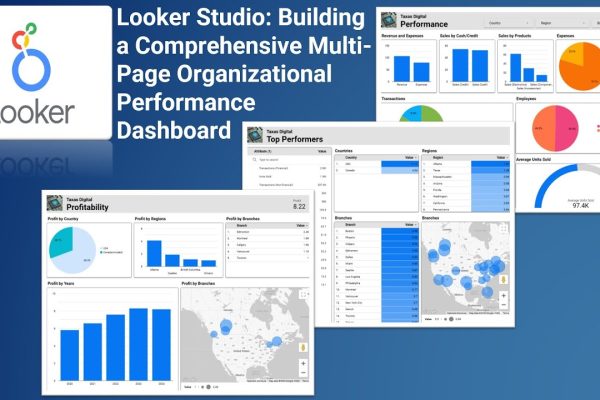
Looker Studio: Building a Comprehensive Multi-Page Organizational Performance Dashboard

Admin1 year ago1 year ago01 mins

This video tutorial demonstrates how to create a multi-page report in Looker Studio, focusing on organizational performance. It covers data…

Read More
  • Google Charts
  • HTML
  • JavaScript

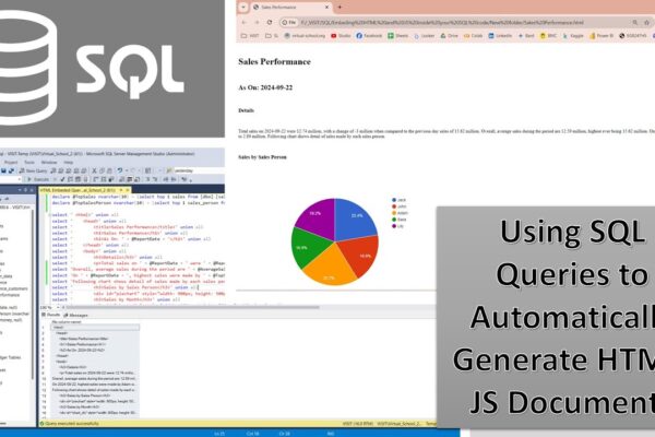
SQL Magic: Auto-Generating HTML Reports (With Google Charts and JavaScript)

Admin2 years ago1 year ago01 mins

This tutorial demonstrates how to generate HTML documents using SQL queries. By embedding HTML code within SQL queries, you can…

Read More
  • Power BI

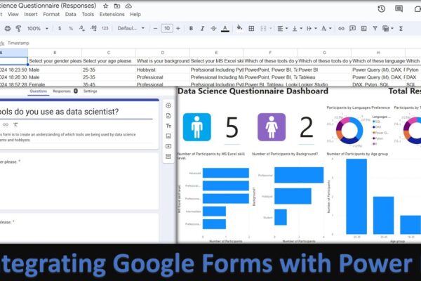
Analyse and Visualize Google Forms Responses using Power BI by Integrating Forms with Power BI

Admin2 years ago1 year ago01 mins

This tutorial demonstrates how to integrate Google Forms responses with Power BI Desktop to create interactive visualizations. It covers creating…

Read More
  • Power BI

Project Weighted Decision Matrix Dashboard

Admin2 years ago1 year ago01 mins

This video tutorial demonstrates how to use Power BI to perform a weighted decision matrix analysis on a set of…

Read More
  • Power BI

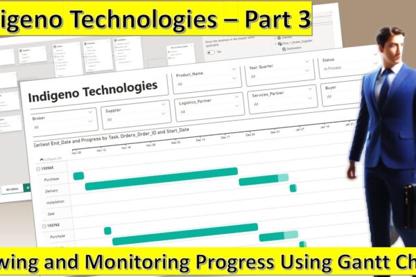
Monitoring Progress Using Gantt Chart – Indigeno Technologies Part 3

Admin2 years ago1 year ago01 mins

This video is part of a multi-part tutorial on using Power BI with a dataset called Indigino Technologies. In this…

Read More
  • Power BI

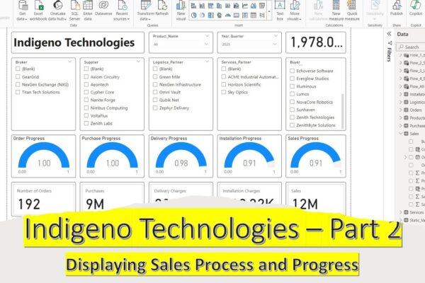
Creating a Dashboard of Sales Process and Pregress (Indigeno Technologies Part 2)

Admin2 years ago1 year ago01 mins

This video tutorial is about creating a dashboard to visualize sales data. It starts by calculating profit on each sale…

Read More
  • DAX
  • Power BI

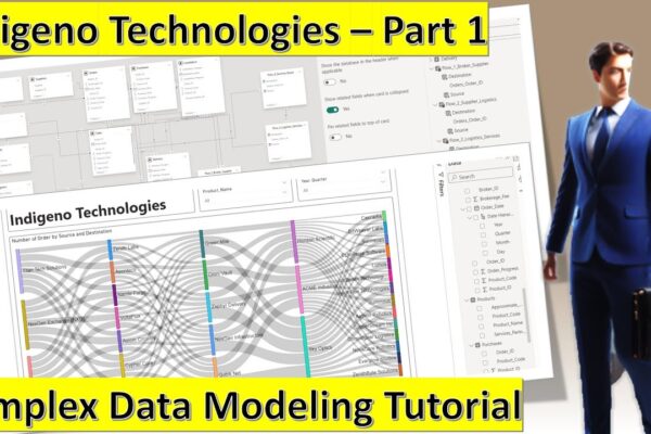
Data Modeling, Creating Relationships, and Tables using DAX (Indigeno Technologies – Part 1)

Admin2 years ago1 year ago01 mins

This tutorial creates a data model and visualizes a flow of orders in Power BI. Here’s a summary: – We…

Read More
  • Python
  • SQL

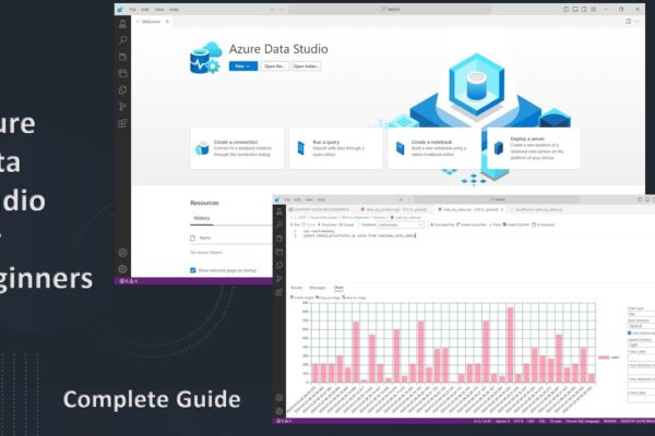
Azure Data Studio – Complete Guide for Beginners including SQL, Python, Sanddance and Dashboards

Admin2 years ago1 year ago01 mins

The video provides an introduction to Azure Data Studio and its functionalities. It covers connecting to SQL servers and databases,…

Read More
  • Power BI

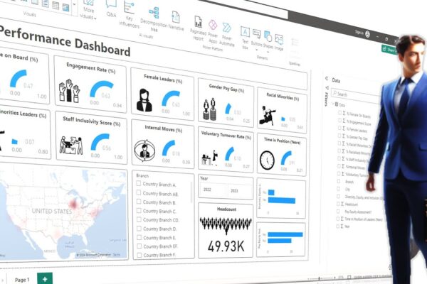
Creating a Stunning HR Performance Dashboard using Images and Slicers and Visuals

Admin2 years ago1 year ago01 mins

This video tutorial creates a beautiful HR performance dashboard in Power BI. The dashboard will include KPIs (Key Performance Indicators)…

Read More
  • DAX
  • Power BI

Power BI: DAX Query View for Beginners – Supercharge Your Dashboards with DAX Query View

Admin2 years ago1 year ago01 mins

The video is about creating a dashboard and exploring Dax query view in Power BI. The speaker first introduces the…

Read More
  • 1
  • 2
  • 3
  • 4
Log in
  • Apps (1)
  • Resources (1)
    • Datasets (1)
  • Topics (12)
    • Data Analysis Expression (DAX) (3)
      • Complete List of DAX Functions (2)
    • Google Looker Studio (3)
      • Complete Guide to the Looker Studio (1)
    • MS Excel (1)
      • Mastering MS Excel (1)
    • Power BI (1)
    • Python (4)
      • Python Complete Course (4)
  • Uncategorized (1)
  • Video Tutorials (309)
    • C# (1)
    • DAX (10)
    • Google Charts (2)
    • HTML (8)
    • JavaScript (8)
    • Looker Studio (12)
    • Maths (1)
    • MS Access (1)
    • MS Excel (61)
    • MS Power Point (3)
    • Other (1)
    • Power Apps (1)
    • Power Automate (4)
    • Power BI (147)
    • Power Query (M Language) (4)
    • Python (54)
    • Quiz (1)
    • R (2)
    • SQL (32)
    • Tableau (1)
    • Unity3d (1)
    • Windows PowerShell (1)

Recent Posts

  • Power BI: Say Goodbye to Complex DAX – Visual Calculations Made Easy
  • The Ten-Digit Empire: How Human Anatomy Built the Modern World (Base 10 System)
  • PowerPoint: Creating Automated Dynamic Presentations with SQL Server Data Integration using Excel
  • PowerShell Lesson 001 Mastering the Environment and Creating your first Script
  • SQL: Unlock SQL Server’s Brain! The Master Database Tutorial including Critical Admin Commands

Recent Comments

  1. Admin on Power BI: Monitor Risk using Capital Adequacy and Risk Weighted Assets Dashboard
  2. Augustine Ahiatsi on Power BI: Monitor Risk using Capital Adequacy and Risk Weighted Assets Dashboard

Popular

1

Power BI: Say Goodbye to Complex DAX – Visual Calculations Made Easy

  • Power BI
2

The Ten-Digit Empire: How Human Anatomy Built the Modern World (Base 10 System)

  • Maths
3

PowerPoint: Creating Automated Dynamic Presentations with SQL Server Data Integration using Excel

  • MS Excel
  • MS Power Point
4

PowerShell Lesson 001 Mastering the Environment and Creating your first Script

  • Windows PowerShell
5

SQL: Unlock SQL Server’s Brain! The Master Database Tutorial including Critical Admin Commands

  • SQL
6

Power BI: Fleet Performance Logistics Dashboard with Driver Safety, Efficiency, and Compliace KPIs

  • Power BI
7

How to define functions in Python: A complete guide for Beginners

  • Python
8

Python Control Flow Mastery: Interruptions and Iteration for Beginners

  • Python

Copyright 2025 virtual-school.org