Data Analysis & Visualization of Global Swift Logistics using Power BI | From JSON to Dashboard

In this video, we dive into a comprehensive data analysis and visualization project for Global Swift Logistics. The project leverages a JSON file containing detailed shipping and transportation information. Using Power BI, we create a dynamic, multi-page dashboard to analyze various aspects of the company’s shipping operations. We start by building a dashboard to track…

Read More

Performing Comparative Analysis by Pivoting Columns in Power Query

In this power BI visualization tutorial, we focus on comparing sales data from a vertical dataset across different years. Beginning with data transformation in the Power Query Editor, we progress to creating a comparative visual for a dashboard. Step by step, we navigate through loading data, adding visual elements like text boxes and line charts,…

Read More

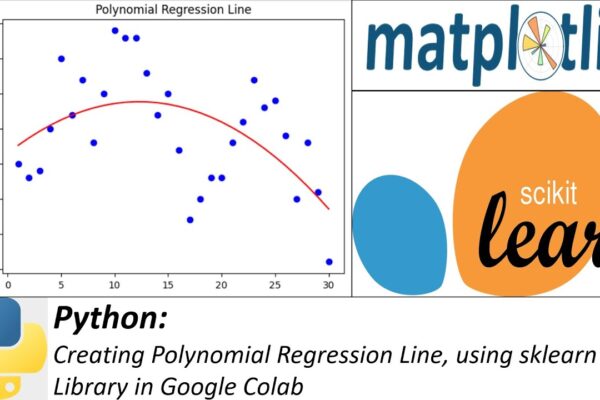
Creating Polynomial Regression Line, using sklearn Library in Google Colab

Welcome to another Python tutorial where we will learn how to create a polynomial regression line using the scikit-learn library. Polynomial regression is a type of linear regression that enables us to model non-linear relationships between variables. In this tutorial, we will cover the following steps: Colab Notebook: https://colab.research.google.com/drive/178bLanYnwxGRqCwLf0YHONBiGtGBJ1Vr?usp=sharing #PythonTutorial #PolynomialRegression #scikitLearn #DataScience #MachineLearning #PythonProgramming…

Read More