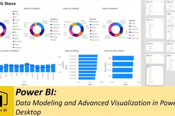
Performing Comparative Analysis by Pivoting Columns in Power Query

In this power BI visualization tutorial, we focus on comparing sales data from a vertical dataset across different years. Beginning with data transformation in the Power Query Editor, we progress to creating a comparative visual for a dashboard. Step by step, we navigate through loading data, adding visual elements like text boxes and line charts,…

Read More

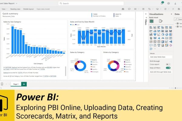
Exploring PBI Online, Uploading Data, Creating Scorecards, Matrix, and Reports

Welcome to this Power BI tutorial! In today’s session, we’ll delve into the Power BI online application, covering topics from importing data to creating scorecards and matrices. Finally, we’ll demonstrate how to craft a report using the smart auto-create feature. Power BI Online Interface: Discover the workspace, files, and documents. Creating Scorecards and Matrices: Learn…

Read More

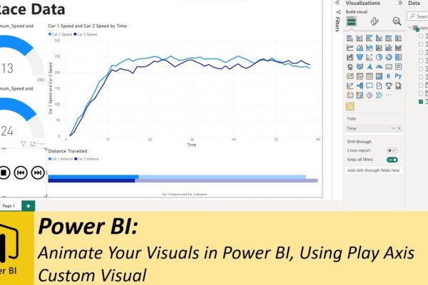
Animate Your Visuals in Power BI, Using Play Axis Custom Visual

Previously, we explored various methods for animating your dashboards using SQL. Whether you want to display real-time data or historical data animations, SQL method works great. However you’ll discover that SQL isn’t always necessary, especially when dealing with historical data. Instead, we introduce you to a handy custom visual known as “play axis,” available for…

Read More