



Performing Comparative Analysis by Pivoting Columns in Power Query

In this power BI visualization tutorial, we focus on comparing sales data from a vertical dataset across different years. Beginning with data transformation in the Power Query Editor, we progress to creating a comparative visual for a dashboard. Step by step, we navigate through loading data, adding visual elements like text boxes and line charts,…
Read More

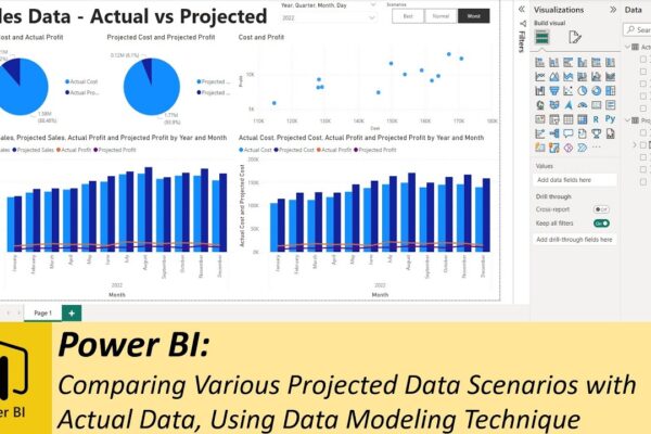
Comparing Various Projected Data Scenarios with Actual Data, Using Data Modeling Technique

In this tutorial, we’re delving into the world of data analysis using Excel and Power BI. We have an Excel file containing both projected and actual sales data, and we’ll guide you through the process of creating an informative dashboard to compare different sales scenarios with the actual data. We’ll cover everything from importing data…

Read More