Creating Business Intelligence Dashboards from SQL Server Tables and Views

This tutorial demonstrates how to create a comprehensive Power BI report using data from a SQL Server database. We’ll delve into various analytical techniques, including geographic analysis, branch-wise performance, and deposit movement. The report will feature interactive dashboards with visualizations like maps, charts, and tables. By the end, you’ll be able to create insightful reports…

Read More

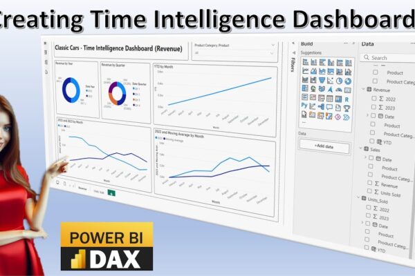
Time Intelligence in Power BI: A Visual Guide

This video tutorial introduces time intelligence calculations and their visualization using Power BI dashboards. It covers various time intelligence concepts, including time series, time bucketing, year-over-year comparison, moving averages, and year-to-date analysis. The tutorial demonstrates how to import data into Power BI, create different visualizations like pie charts and line charts, and perform calculations to…

Read More

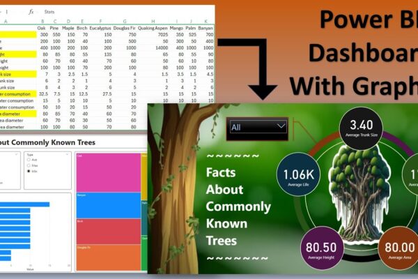
Make Your Data Grow: Tree Stats with Power BI

This is a video tutorial about creating a report on tree statistics using Power BI. The video covers how to import and transform data, add images and backgrounds, create different visuals (slicers, bar charts, tree maps, card visuals), and format the report for better presentation. Link to dataset, power bi file, and images used:https://drive.google.com/file/d/1yRz7kM0ZGM0Mo9oeKBL9wSrrvoHYrGbE/view?usp=sharing #PowerBI…

Read More

Performing Comparative Analysis by Pivoting Columns in Power Query

In this power BI visualization tutorial, we focus on comparing sales data from a vertical dataset across different years. Beginning with data transformation in the Power Query Editor, we progress to creating a comparative visual for a dashboard. Step by step, we navigate through loading data, adding visual elements like text boxes and line charts,…

Read More

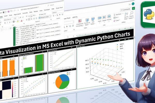
Data Visualization in MS Excel with Dynamic Python Charts

Welcome back, everyone! In this unique tutorial, we’ll guide you through creating a dynamic dashboard in Microsoft Excel using Python. Specifically tailored for those keen on mastering Python visualizations, we’ll delve into the world of Excel charts powered by Python’s Matplotlib library. Notably, unlike Excel’s native charts, Python charts seamlessly integrate within cells, providing a…

Read More

Assets Management in Power BI for Business and Finance Professionals

In this instructional session, finance professionals are guided through the process of managing assets and presenting financial data in charts. The focus is on calculating depreciation, accumulated depreciation, and net book value using two methods: straight line and declining balance. The tutorial demonstrates how to incorporate these calculations into a Power BI dashboard, emphasizing their…

Read More

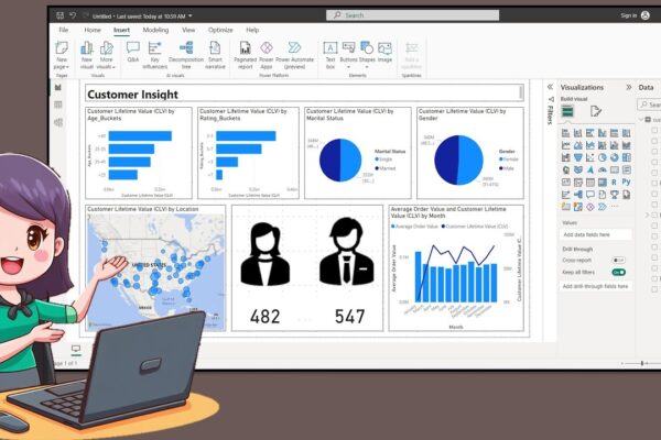
How to Create a Nice Customer Insight Dashboar in Power BI Desktop

In this tutorial, the presenter welcomes the audience back and introduces the creation of a customer insight dashboard using data available on Kaggle. The process involves creating age and rating buckets using Data Analysis Expression, exporting icons from PowerPoint, and incorporating them into the dashboard. The tutorial covers turning on map visuals, adjusting canvas size,…

Read More