Skip to content
Wednesday, September 16, 2026
Power Query vs DAX for Beginners: When to Use Which in Power BI?
How to Peform YoY Comparison in Power BI – For Begginers
Complete Power BI Tutorial with Custom Graphics, Animated Background, Dynamic Values and Much More – Global E-Commerce Supply Chain
North American Company

Virtual School

This Week
  • Home
  • Profile
  • Topics
  • Video Tutorials
  • Resources
Power Query vs DAX for Beginners: When to Use Which in Power BI?
How to Peform YoY Comparison in Power BI – For Begginers
Complete Power BI Tutorial with Custom Graphics, Animated Background, Dynamic Values and Much More – Global E-Commerce Supply Chain
North American Company

Virtual School

This Week
  • Home
  • Profile
  • Topics
  • Video Tutorials
  • Resources

Power Query vs DAX for Beginners: When to Use Which in Power BI?

1 week ago1 week ago

How to Peform YoY Comparison in Power BI – For Begginers

3 weeks ago3 weeks ago

Complete Power BI Tutorial with Custom Graphics, Animated Background, Dynamic Values and Much More – Global E-Commerce Supply Chain

1 month ago1 month ago

North American Company

2 months ago2 months ago

How to Fix Mapping Errors in Power BI (Accurate Location Data Tutorial)

2 months ago2 months ago

Power BI: Build a Dynamic Risk Matrix Simulation in Power BI Using DAX & Parameters

2 months ago2 months ago

Excel: How to Correct Wrong Date Formats in Seonds without using Complex Forumulas and Methods.

2 months ago2 months ago

Power BI Desktop: Creating Dashboard with 60,000 Plus Photos and Generating Dataset from file names

2 months ago2 months ago

Learn By Example: Python File Organizer – Learn Windows Automation using os, shutil, and pathlib

3 months ago3 months ago

Data Analysis with R: Tutorial for Beginners – Want to Learn Data Analysis with R, Start Here

3 months ago3 months ago
  • Home
  • Video Tutorials
  • Page 23

Video Tutorials

  • Power BI

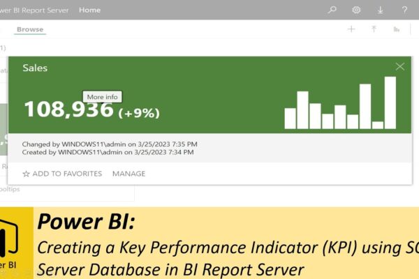
Creating a Key Performance Indicator (KPI) using SQL Server Database in BI Report Server

Shahid Latif3 years ago2 years ago01 mins

This video is a tutorial on how to create a KPI (Key Performance Indicator) using SQL Server Database. The video starts with an introduction to KPI and its importance in evaluating progress towards measurable goals. Then the video demonstrates the steps to allow SQL server to use TCP port and IP address, which enables access…
Read More
  • Power BI

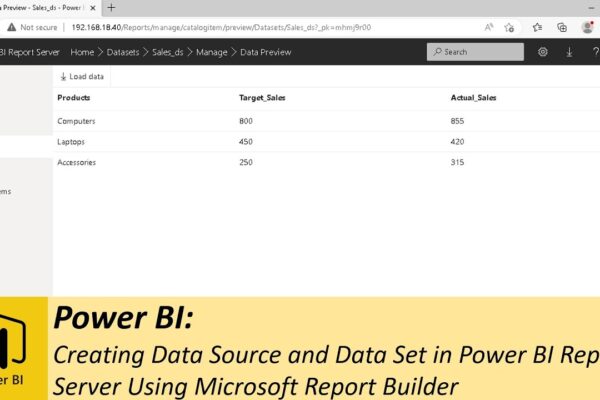
Creating Data Source and Data Set in Power BI Report Server Using Microsoft Report Builder

Shahid Latif3 years ago2 years ago02 mins

This video tutorial explains how to create a simple dataset in Power BI Report Server. The tutorial covers the steps required to create a new folder, to place the dataset. The next step is to download and install Microsoft Report Builder. The tutorial shows how to download and install the Report Builder, which is required…

Read More
  • Power BI

Setting up Power BI Report Server, Uploading Reports, LAN & Internet Access, & Embedding

Shahid Latif3 years ago2 years ago02 mins

The video explains the process of installing and running a Power BI Report Server from a virtual machine. The video recommends running the Report Server from a virtual machine for better security. The video then explains the process of downloading and installing SQL Server Express, which is required to run the Power BI Report Server….

Read More
  • Other

Creating and Setting up a Virtual Machine with Windows 11

Shahid Latif3 years ago2 years ago02 mins

The video explains how to set up a virtual machine and install Windows 11 on it. A virtual machine is a software-based computer that provides an isolated environment for running an operating system or application. The reasons for using a virtual machine include security concerns, software testing, running an OS other than the host OS…

Read More
  • Power BI

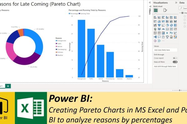
Creating Pareto Charts in MS Excel and Power BI to analyze reasons by percentages

Shahid Latif3 years ago2 years ago02 mins

The video is a tutorial on how to use Pareto Charts in MS Excel and Power BI to analyze a hypothetical problem. The problem that is being analyzed is the reasons why people are late to their office. The video explains that a Pareto chart is a combination of bars and lines that displays percentages…

Read More
  • Power BI

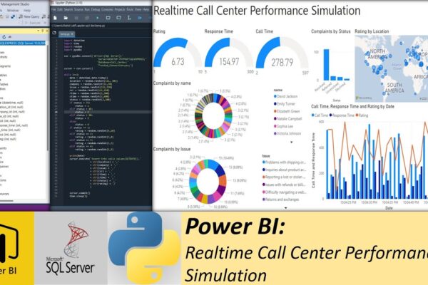
Realtime Call Center Performance Simulation using Python, SQL and Power BI

Shahid Latif4 years ago2 years ago03 mins

The video is a tutorial on how to simulate real-time performance monitoring of a call center using Python, Microsoft SQL Server, and Power BI. The video starts by explaining that the simulation will generate random calls from customers and store the call center information in a Microsoft SQL server database for performance monitoring. The speaker…

Read More
  • Power BI

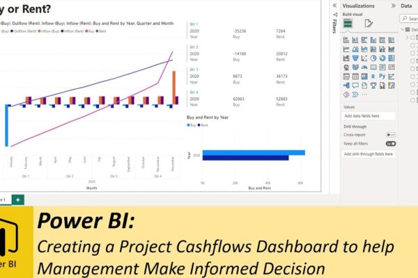
Creating a Project Cashflows Dashboard to help Management Make Informed Decision

Shahid Latif4 years ago2 years ago02 mins

The video is a tutorial on how to create a dashboard to present financial data related to two options for starting a new project – buying machinery or renting it. The data, containing inflows and outflows for both options, is available in an Excel file. The video shows how to create a dashboard using Microsoft…

Read More
  • Power BI

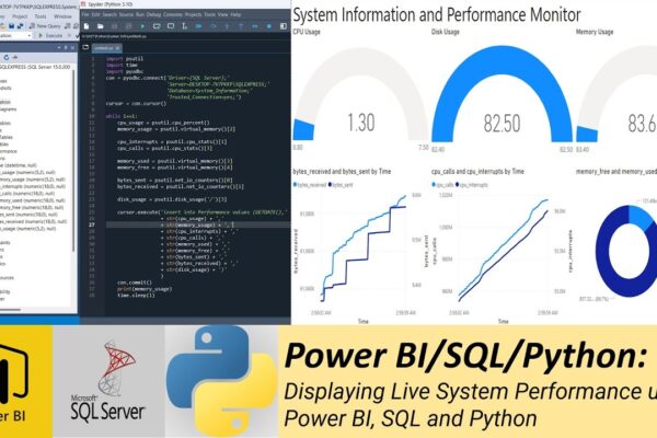
Displaying Live System Performance using Power BI, SQL and Python

Shahid Latif4 years ago2 years ago02 mins

The video explains a step-by-step guide on how to display system performance information in real-time using Python, Microsoft SQL Server, and Power BI Desktop. The narrator explains that this exercise will help learners understand Python, SQL, and Power BI Desktop and how to connect the three major data science applications. The video begins by explaining…

Read More
  • Power BI

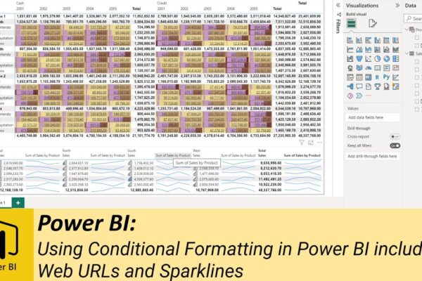
Using Conditional Formatting in Power BI including Web URLs and Sparklines

Shahid Latif4 years ago2 years ago03 mins

This video tutorial is about Conditional Formatting in Power BI. The video starts by defining conditional formatting and its significance in data analysis. Conditional formatting is a feature in Power BI that allows users to format data based on specific conditions. It is used to highlight key insights in data and make it easier for…

Read More
  • MS Excel

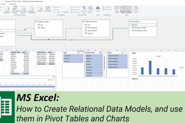
How to Create Relational Data Models, and use them in Pivot Tables and Charts

Shahid Latif4 years ago2 years ago02 mins

The video is a tutorial on how to create a relational data model using Microsoft Excel. The tutorial begins with an introduction to the concept of a data model and proceeds to show how to convert Excel sheets into tables before defining relationships between the tables to create a data model. The speaker emphasizes the…

Read More
  • 1
  • …
  • 21
  • 22
  • 23
  • 24
  • 25
  • …
  • 32
Log in
  • Apps (1)
  • Resources (1)
    • Datasets (1)
  • Topics (12)
    • Data Analysis Expression (DAX) (3)
      • Complete List of DAX Functions (2)
    • Google Looker Studio (3)
      • Complete Guide to the Looker Studio (1)
    • MS Excel (1)
      • Mastering MS Excel (1)
    • Power BI (1)
    • Python (4)
      • Python Complete Course (4)
  • Uncategorized (2)
  • Video Tutorials (318)
    • C# (1)
    • DAX (10)
    • Google Charts (2)
    • HTML (8)
    • JavaScript (8)
    • Looker Studio (12)
    • Maths (1)
    • MS Access (1)
    • MS Excel (62)
    • MS Power Point (3)
    • Other (1)
    • Power Apps (1)
    • Power Automate (4)
    • Power BI (153)
    • Power Query (M Language) (4)
    • Python (55)
    • Quiz (1)
    • R (3)
    • SQL (32)
    • Tableau (1)
    • Unity3d (1)
    • Windows PowerShell (1)

Recent Posts

  • Power Query vs DAX for Beginners: When to Use Which in Power BI?
  • How to Peform YoY Comparison in Power BI – For Begginers
  • Complete Power BI Tutorial with Custom Graphics, Animated Background, Dynamic Values and Much More – Global E-Commerce Supply Chain
  • North American Company
  • How to Fix Mapping Errors in Power BI (Accurate Location Data Tutorial)

Recent Comments

  1. Admin on Complete Guide to the Looker Studio: Sharing Looker Studio Reports
  2. Nik A Hafiz on Complete Guide to the Looker Studio: Sharing Looker Studio Reports
  3. Admin on Power BI: Monitor Risk using Capital Adequacy and Risk Weighted Assets Dashboard
  4. Augustine Ahiatsi on Power BI: Monitor Risk using Capital Adequacy and Risk Weighted Assets Dashboard
Log in
  • Home
  • Profile
  • Topics
  • Video Tutorials
  • Resources

Copyright 2025 virtual-school.org