Skip to content
Wednesday, July 29, 2026
How to Fix Mapping Errors in Power BI (Accurate Location Data Tutorial)
Power BI: Build a Dynamic Risk Matrix Simulation in Power BI Using DAX & Parameters
Excel: How to Correct Wrong Date Formats in Seonds without using Complex Forumulas and Methods.
Power BI Desktop: Creating Dashboard with 60,000 Plus Photos and Generating Dataset from file names

Virtual School

This Week
Log in
  • Home
  • Profile
  • Topics
  • Video Tutorials
  • Resources
  • Home
  • Profile
  • Topics
  • Video Tutorials
  • Resources
How to Fix Mapping Errors in Power BI (Accurate Location Data Tutorial)
Power BI: Build a Dynamic Risk Matrix Simulation in Power BI Using DAX & Parameters
Excel: How to Correct Wrong Date Formats in Seonds without using Complex Forumulas and Methods.
Power BI Desktop: Creating Dashboard with 60,000 Plus Photos and Generating Dataset from file names

Virtual School

This Week
  • Home
  • Profile
  • Topics
  • Video Tutorials
  • Resources

How to Fix Mapping Errors in Power BI (Accurate Location Data Tutorial)

14 hours ago14 hours ago

Power BI: Build a Dynamic Risk Matrix Simulation in Power BI Using DAX & Parameters

3 days ago3 days ago

Excel: How to Correct Wrong Date Formats in Seonds without using Complex Forumulas and Methods.

3 days ago3 days ago

Power BI Desktop: Creating Dashboard with 60,000 Plus Photos and Generating Dataset from file names

3 weeks ago3 weeks ago

Learn By Example: Python File Organizer – Learn Windows Automation using os, shutil, and pathlib

1 month ago1 month ago

Data Analysis with R: Tutorial for Beginners – Want to Learn Data Analysis with R, Start Here

1 month ago1 month ago

Power BI: Say Goodbye to Complex DAX – Visual Calculations Made Easy

2 months ago2 months ago

The Ten-Digit Empire: How Human Anatomy Built the Modern World (Base 10 System)

2 months ago2 months ago

PowerPoint: Creating Automated Dynamic Presentations with SQL Server Data Integration using Excel

3 months ago3 months ago

PowerShell Lesson 001 Mastering the Environment and Creating your first Script

3 months ago3 months ago
  • Home
  • Video Tutorials
  • MS Excel
  • Page 5

MS Excel

  • MS Excel

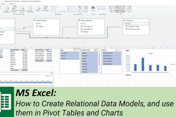
How to Create Relational Data Models, and use them in Pivot Tables and Charts

Shahid Latif3 years ago2 years ago02 mins

The video is a tutorial on how to create a relational data model using Microsoft Excel. The tutorial begins with an introduction to the concept of a data model and proceeds to show how to convert Excel sheets into tables before defining relationships between the tables to create a data model. The speaker emphasizes the…
Read More
  • MS Excel

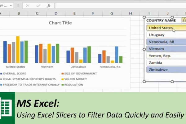
Using Excel Slicers to Filter Data Quickly and Easily

Shahid Latif3 years ago2 years ago02 mins

This video is a tutorial on how to use Excel’s slicer tool to filter data quickly and easily. The video starts with an introduction to the purpose of slicers, which is to filter data to find specific information quickly. The presenter then goes on to demonstrate how to use slicers on a table of sample…

Read More
  • MS Excel

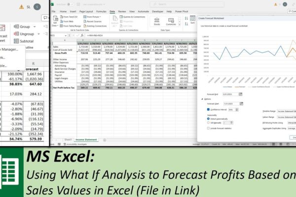
Using What If Analysis to Forecast Profits Based on Sales Values in Excel

Shahid Latif3 years ago2 years ago02 mins

The video explains how to use different what-if analysis tools in Excel to forecast profits based on historical data and sales values. The tools used in this video include Scenario Manager, Goal Seek, Data Table, and Forecast Sheet. The video starts by creating a new column and using the average formula to calculate the average…

Read More
  • MS Excel

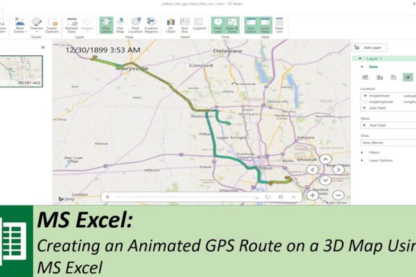
Creating an Animated GPS Route on a 3D Map Using MS Excel

Shahid Latif3 years ago2 years ago02 mins

The video is a tutorial that guides the viewer through the process of creating an animated GPS route on a 3D map using Microsoft Excel. The presenter explains that to design this visualization, three columns are required: GPS coordinates in latitude and longitude, and a time column. To begin, the presenter suggests downloading GPS data…

Read More
  • MS Excel

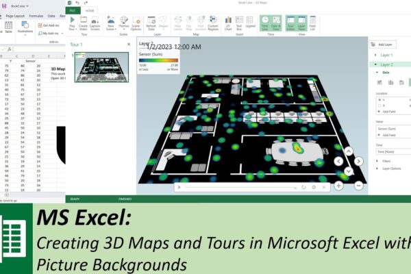
Creating 3D Maps and Tours in Microsoft Excel with Picture Backgrounds

Shahid Latif3 years ago2 years ago03 mins

This video is a tutorial on how to create a 3D map using Microsoft Excel. The presenter begins by stating that the information will be presented using Microsoft Excel 3D maps, and a picture background map will be used to display sensor data. The video provides step-by-step instructions for creating the 3D map. First, the…

Read More
  • MS Excel

How to add serial numbers to identical items without sorting the data

Shahid Latif3 years ago2 years ago01 mins

Today we will show you how to add serial numbers to identical items without sorting the data, using the countifs function.

Read More
  • MS Excel

What lies beneath an Excel file?

Shahid Latif3 years ago2 years ago01 mins

MS Excel files are containers (like compressed folders) that contain several XML files with data that you see in MS Excel spread sheets. You can view the raw XML files by opening Excel files as zip or rar files in any compression utility.

Read More
  • MS Excel
  • Power BI

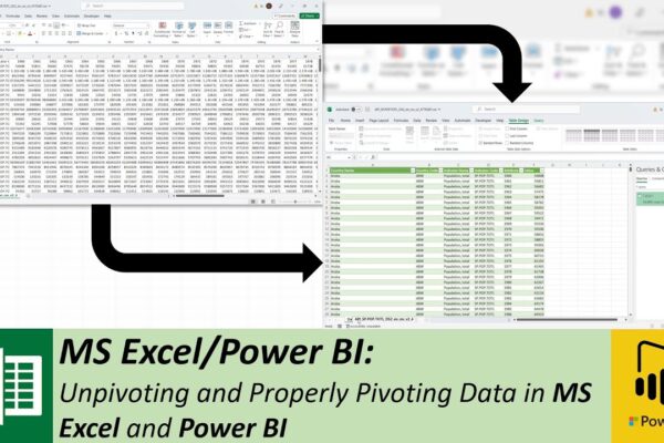
Unpivoting and Properly Pivoting Data in MS Excel and Power BI

Shahid Latif3 years ago2 years ago02 mins

In this video, the speaker explains how to unpivot data in Microsoft Excel and Power BI. The data used in the video is world population data downloaded from the World Bank, which is already pivoted, but not in the form of an Excel pivot table. The speaker wants to convert this data into an unpivoted…

Read More
  • MS Excel

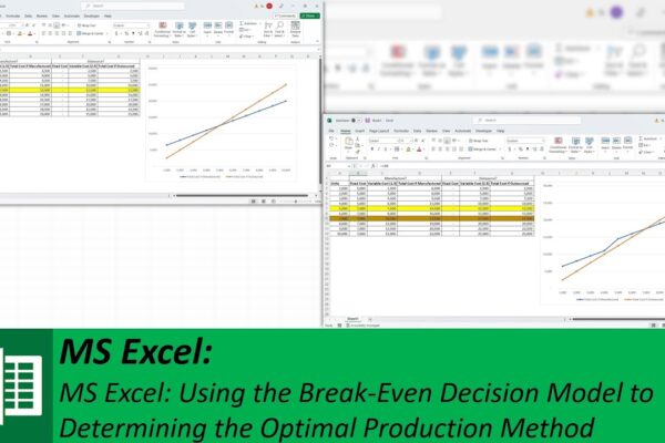
Using the Break-Even Decision Model to Determine the Optimal Production Method

Shahid Latif3 years ago2 years ago02 mins

The video explains how to design a break-even decision model in Microsoft Excel to determine whether it is more cost-effective to manufacture a product or outsource it. The model is created by comparing the total costs associated with both manufacturing and outsourcing the product. The model takes into account the number of units, fixed costs,…

Read More
  • MS Excel

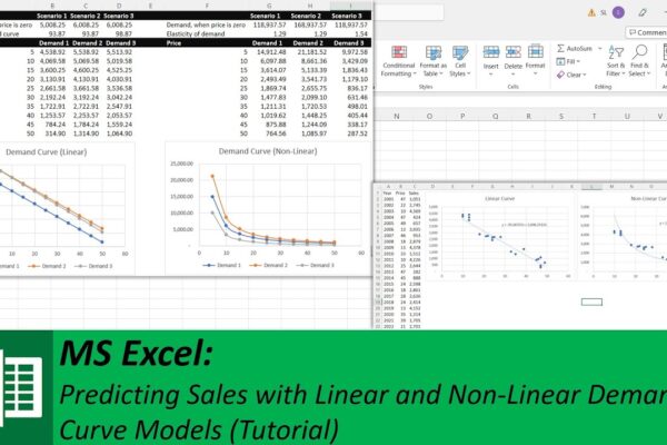
Predicting Sales with Linear and Non-Linear Demand Curve Models

Shahid Latif3 years ago2 years ago02 mins

In this video, the presenter is discussing how to predict sales or demand through linear and non-linear prediction models based on the demand curve. The demand curve is a graphical representation of the relationship between the price of a good or service and the quantity of it that consumers are willing and able to purchase….

Read More
  • 1
  • …
  • 3
  • 4
  • 5
  • 6
  • 7
Log in
  • Apps (1)
  • Resources (1)
    • Datasets (1)
  • Topics (12)
    • Data Analysis Expression (DAX) (3)
      • Complete List of DAX Functions (2)
    • Google Looker Studio (3)
      • Complete Guide to the Looker Studio (1)
    • MS Excel (1)
      • Mastering MS Excel (1)
    • Power BI (1)
    • Python (4)
      • Python Complete Course (4)
  • Uncategorized (1)
  • Video Tutorials (315)
    • C# (1)
    • DAX (10)
    • Google Charts (2)
    • HTML (8)
    • JavaScript (8)
    • Looker Studio (12)
    • Maths (1)
    • MS Access (1)
    • MS Excel (62)
    • MS Power Point (3)
    • Other (1)
    • Power Apps (1)
    • Power Automate (4)
    • Power BI (150)
    • Power Query (M Language) (4)
    • Python (55)
    • Quiz (1)
    • R (3)
    • SQL (32)
    • Tableau (1)
    • Unity3d (1)
    • Windows PowerShell (1)

Recent Posts

  • How to Fix Mapping Errors in Power BI (Accurate Location Data Tutorial)
  • Power BI: Build a Dynamic Risk Matrix Simulation in Power BI Using DAX & Parameters
  • Excel: How to Correct Wrong Date Formats in Seonds without using Complex Forumulas and Methods.
  • Power BI Desktop: Creating Dashboard with 60,000 Plus Photos and Generating Dataset from file names
  • Learn By Example: Python File Organizer – Learn Windows Automation using os, shutil, and pathlib

Recent Comments

  1. Admin on Complete Guide to the Looker Studio: Sharing Looker Studio Reports
  2. Nik A Hafiz on Complete Guide to the Looker Studio: Sharing Looker Studio Reports
  3. Admin on Power BI: Monitor Risk using Capital Adequacy and Risk Weighted Assets Dashboard
  4. Augustine Ahiatsi on Power BI: Monitor Risk using Capital Adequacy and Risk Weighted Assets Dashboard

Popular

1

How to Fix Mapping Errors in Power BI (Accurate Location Data Tutorial)

  • Power BI
2

Power BI: Build a Dynamic Risk Matrix Simulation in Power BI Using DAX & Parameters

  • Power BI
3

Excel: How to Correct Wrong Date Formats in Seonds without using Complex Forumulas and Methods.

  • MS Excel
4

Power BI Desktop: Creating Dashboard with 60,000 Plus Photos and Generating Dataset from file names

  • Power BI
5

Learn By Example: Python File Organizer – Learn Windows Automation using os, shutil, and pathlib

  • Python
6

Data Analysis with R: Tutorial for Beginners – Want to Learn Data Analysis with R, Start Here

  • R
7

Power BI: Say Goodbye to Complex DAX – Visual Calculations Made Easy

  • Power BI
8

The Ten-Digit Empire: How Human Anatomy Built the Modern World (Base 10 System)

  • Maths

Copyright 2025 virtual-school.org