Shahid Latif

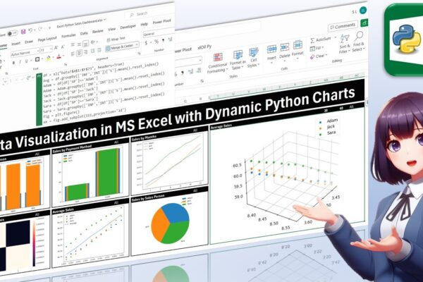
Data Visualization in MS Excel with Dynamic Python Charts

Welcome back, everyone! In this unique tutorial, we’ll guide you through creating a dynamic dashboard in Microsoft Excel using Python. Specifically tailored for those keen on mastering Python visualizations, we’ll delve into the world of Excel charts powered by Python’s Matplotlib library. Notably, unlike Excel’s native charts, Python charts seamlessly integrate within cells, providing a…

Read More

Assets Management in Power BI for Business and Finance Professionals

In this instructional session, finance professionals are guided through the process of managing assets and presenting financial data in charts. The focus is on calculating depreciation, accumulated depreciation, and net book value using two methods: straight line and declining balance. The tutorial demonstrates how to incorporate these calculations into a Power BI dashboard, emphasizing their…

Read More

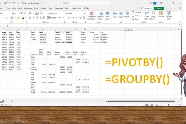
Complete Guide to use Groupby and Pivotby functions newly introduced by Microsoft

In this tutorial, we explore the newly introduced Pivot By and Group By functions in Microsoft Excel. Learn how to dynamically summarize and modify your data with these powerful tools. Whether you’re an Excel novice or an advanced user, these functions can enhance your data analysis capabilities. #groupby #pivotby #ExcelTips #DataAnalysis #MicrosoftExcel #PivotTables #ExcelFunctions #DataVisualization…

Read More

Easily Pivoting and Combining tables, using Power Query Editor

Unlock the power of data analysis with our latest tutorial! In this step-by-step guide, we’ll show you how to leverage Power BI Desktop to transform a CSV file containing monthly sales, expenses, profitability, and customer count into an insightful dashboard for yearly comparisons. Learn to create pivot tables using Power Query, combine them into a…

Read More

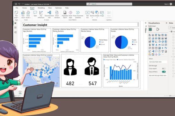
How to Create a Nice Customer Insight Dashboar in Power BI Desktop

In this tutorial, the presenter welcomes the audience back and introduces the creation of a customer insight dashboard using data available on Kaggle. The process involves creating age and rating buckets using Data Analysis Expression, exporting icons from PowerPoint, and incorporating them into the dashboard. The tutorial covers turning on map visuals, adjusting canvas size,…

Read More

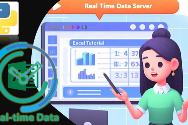
Using Python Real Time Data Server to Display information in MS Excel

Welcome to another tutorial on real-time data in MS Excel! In our previous sessions, we explored building add-ins in VBA to display real-time information. Today, we’re diving into the world of Python, leveraging Real-Time Data Server technology to showcase real-time data in MS Excel. Unlike traditional methods, we’ll create our own functions in Python to…

Read More