Power BI: Build a Dynamic Risk Matrix Simulation in Power BI Using DAX & Parameters

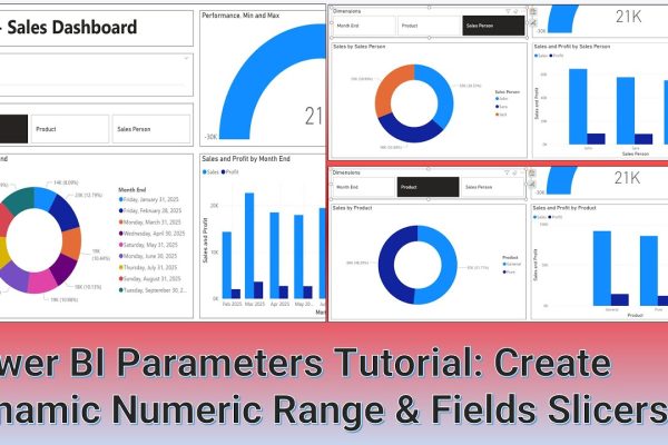
In this hands-on Power BI tutorial, you’ll learn how to build an interactive Risk Matrix Simulation from scratch without relying on external datasets. Using DAX to generate dynamic tables and numeric range parameter sliders, you will model key risk factors including probability, impact, and remaining exposure to simulate real-world scenarios. We step through creating the…

Read More

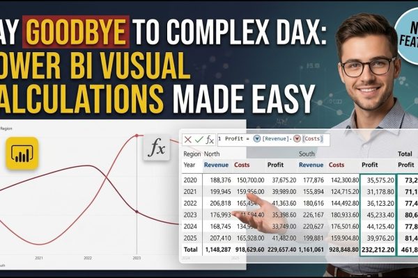
Power BI: Say Goodbye to Complex DAX – Visual Calculations Made Easy

Visual calculations, introduced by Microsoft in Public Preview in February 2024 for Power BI Desktop, revolutionized the way users manipulate data by simplifying complex reporting processes. Previously, achieving specific business metrics required an advanced understanding of intricate DAX concepts such as Filter Context, Row Context, and Context Transition, which often resulted in highly complex and…

Read More

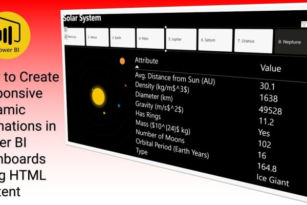
Power BI: How to Create Responsive Dynamic Animations in Power BI Dashboards using HTML Content

Welcome back! In this interesting Power BI tutorial, we show you how to elevate your dashboards by incorporating cool, responsive HTML animations. Utilizing the completely free HTML Content visual, we demonstrate how to embed a dynamic, AI-generated solar system animation right into your Power BI canvas. The key to making it interactive is a find-and-replace…

Read More

Power BI: Employees Joining Bonus Evaluation Dashboard

This Power BI tutorial provides a step-by-step guide to analyzing employee bonus payments and recoveries. Using a provided dataset, the video demonstrates how to create a comprehensive dashboard to track bonuses, active and exited employees, and net payments. Key steps include importing and preparing the data, creating multiple pages for payments and recoveries, and designing…

Read More

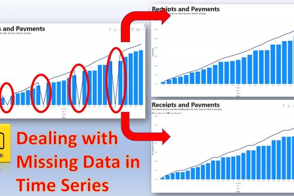
Power BI: Dealing with Missing Data in Time Series – Using Filters and DAX Query

This tutorial addresses the common problem of missing data in time series visualizations, particularly when dealing with progressive or accumulative data in Power BI. It explains that while missing data points might appear as zeros in standard charts, this can lead to inaccuracies when values represent cumulative totals. The video demonstrates two solutions: first, filtering…

Read More