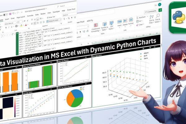
Data Visualization in MS Excel with Dynamic Python Charts

Welcome back, everyone! In this unique tutorial, we’ll guide you through creating a dynamic dashboard in Microsoft Excel using Python. Specifically tailored for those keen on mastering Python visualizations, we’ll delve into the world of Excel charts powered by Python’s Matplotlib library. Notably, unlike Excel’s native charts, Python charts seamlessly integrate within cells, providing a…
Read More

Using Python Real Time Data Server to Display information in MS Excel

Welcome to another tutorial on real-time data in MS Excel! In our previous sessions, we explored building add-ins in VBA to display real-time information. Today, we’re diving into the world of Python, leveraging Real-Time Data Server technology to showcase real-time data in MS Excel. Unlike traditional methods, we’ll create our own functions in Python to…

Read More

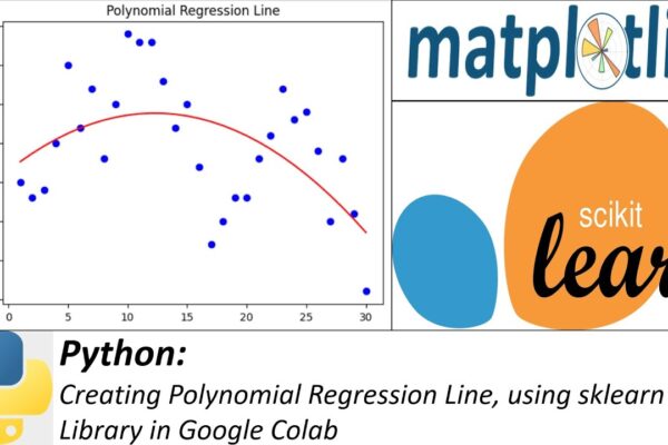
Creating Polynomial Regression Line, using sklearn Library in Google Colab

Welcome to another Python tutorial where we will learn how to create a polynomial regression line using the scikit-learn library. Polynomial regression is a type of linear regression that enables us to model non-linear relationships between variables. In this tutorial, we will cover the following steps: Colab Notebook: https://colab.research.google.com/drive/178bLanYnwxGRqCwLf0YHONBiGtGBJ1Vr?usp=sharing #PythonTutorial #PolynomialRegression #scikitLearn #DataScience #MachineLearning #PythonProgramming…

Read More